


I need to do this with CSS. But it can not be border .
Follow the form: 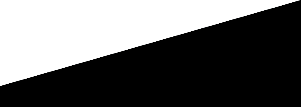
It can not be bordered because forms using border do not allow me to place text within them.
I need to do this with CSS. But it can not be border .
Follow the form:
It can not be bordered because forms using border do not allow me to place text within them.
Just one line of CSS, using gradient instead of solid color:
background: linear-gradient(170deg, #ffffff 0%,#fff 49.8%,#000 50.2%,#000 100%);
Here is a very simple example, already prefixed for various browsers:
#elemento {
  background: #ffffff;
  background: -moz-linear-gradient(-13deg, #fff 0%, #fff 49.8%, #000 50.2%, #000 100%);
  background: -webkit-linear-gradient(-13deg, #fff 0%,#fff 49.8%,#000 50.2%,#000 100%);
  background: linear-gradient(167deg, #ffffff 0%,#fff 49.8%,#000 50.2%,#000 100%);

  width:400px;
  height:180px;
  border: 1px solid red;
  text-align:center;
  color:#ccc;
  font-size:80px;
}
<div id="elemento">TEXTO<br>TEXTO</div>I've put the prefixed versions more to show the syntax difference in the angle part, but the modern versions of the browsers work fine without the prefixes.
I left a minimum "go" of 0.4 in the center encounter to improve interpolation. It is worth mentioning that browsers that are based on Chromium have a precarious implementation that leads to a bit of serialization, this is a problem of programming the browser and not the technique used. So much so that IE11, for example, is perfect.
You can do this by using the transform: rotate(); property:
.container {
    height: 180px;
    width: 100%;
    border: 1px solid #000;
    position: relative;
    overflow: hidden;
}
.shape {
    background: #000;
    height: 150px;
    width: 112%;
    position: absolute;
    bottom: -50px;
    left: -8px;
    transform: rotate(-10deg);
}
.reshape {
    color: #fff;
    text-align: center;
}
<div class="container">
<div class="shape">
<div class="reshape">texto aqui</div>
</div>
</div>If you just want to rotate the text to the starting position:
.container {
    height: 180px;
    width: 100%;
    border: 1px solid #000;
    position: relative;
    overflow: hidden;
}
.shape {
    background: #000;
    height: 150px;
    width: 112%;
    position: absolute;
    bottom: -50px;
    left: -8px;
    transform: rotate(-10deg);
}
.reshape {
    color: #fff;
    text-align: center;
    transform: rotate(10deg);
    margin-top: 10px;
}
<div class="container">
<div class="shape">
<div class="reshape">texto aqui</div>
</div>
</div>