How to maintain the proportions of an image inside a fixed size div in CSS?

1

I'm having trouble creating an image that stays inside a div, maintaining its proportions. However the div has a default size, and can not exceed this limit size.

Below is an image that illustrates my intention:

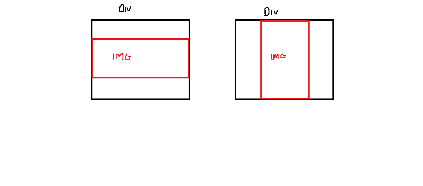
Below is the code in css that I made, the image continues in its defaults, however it is not limited in the div, often surpassing the desired size that fits on the screen:

  #div{
      padding-top: 20px;
      padding-bottom: 20px;
      width: 50%;
      height: auto ;
    }
  #imagem{
      width: auto;
      height: auto;
      top: 5%;
      left: 26%;
    }

Possibly the code is without much sense since I'm programming the web soon.

    
asked by anonymous 23.06.2016 / 20:50

1 answer

1

Good afternoon. You should leave the image responsive, so that it can adapt to the container (parent element), the div in question. Use the max-width property: 100%; in the image. The max-width will prevent the image from exceeding the maximum size of the parent element. Remember to use agum type of positioning in the parent div (float for example), if it is static (default value), the internal elements are not restricted to it.

Example:

#imagem {
   max-width: 100%;
   float: left;
}

#div {
   float: left;
   width: 50%; /* 50% do tamanho do elemento pai */
}

If you need the margin use padding in the parent div.

    
23.06.2016 / 21:34