


I have a div and inside it I have 2 more, one for an image and one for a text. I need the image to always be centered vertically, regardless of the size of the text.
.lista_teste{
    width: 100%;
    height: 100%;
    background: #ccc;
    float: left;
}

.line_teste {
    width: 80%;
    height: 100%;
    margin: 5% 10%;
}

.check_teste{
    width: 10%;
    float: left;
}

.texto_teste {
    width: 85%;
    float: right;
}
<div class="lista_teste">
<div class="line_teste">
<div class="check_teste">
<img src="http://manoapp.com.br/images/bullet_blue.png"></img></div><divclass="texto_teste">
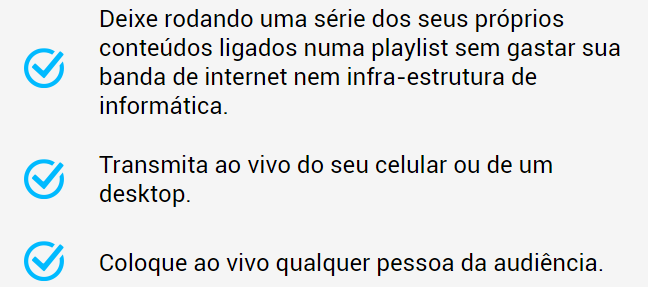
<span>Deixe rodando uma série dos seus próprios conteúdos ligados numa playlist sem gastar sua banda de internet nem infra-estrutura de informática.</span>
</div>
</div>
<div class="clear"></div>
<div class="line_teste">
<div class="check_teste">
<img src="http://manoapp.com.br/images/bullet_blue.png"></img></div><divclass="texto_teste">
<span>Transmita ao vivo do seu celular ou de um desktop.</span>
</div>
</div>
<div class="clear"></div>
<div class="line_teste">
<div class="check_teste">
<img src="http://manoapp.com.br/images/bullet_blue.png"></img></div><divclass="texto_teste">
<span>Coloque ao vivo qualquer pessoa da audiência.</span>
</div>
</div>
</div> The image below shows how I want it to stay.
Relate the item