


Personally I needed to make an effect skew via css transform: skew(40deg); but when doing this it distorts the text of my link I would also like to know if there is a way to do this to just change the background-color of my link remembering that you will have a :hover also follows the code;
Css:
background-color: rgba(22, 47, 76, 0.4117647058823529);
padding: 25px 20px 27px;
display: block;
color: @white;
font-weight: bold;
transform: skew(40deg);
Html:
<ul class="list-unstyled list-inline list-menu-client hidden-xs hidden-sm">
    <li><a href="#"><i class="fa fa-globe" aria-hidden="true"></i><br>Meira Online</a></li>
    <li><a href="#"><i class="fa fa-file-text" aria-hidden="true"></i><br>Holerites</a></li>
    <li><a href="#"><i class="fa fa-usd" aria-hidden="true"></i><br>Banco de Negócios</a></li>
    <li><a href="#"><i class="fa fa-mobile" aria-hidden="true"></i><br>Contato</a></li>
</ul>
That's what happens with my menu:
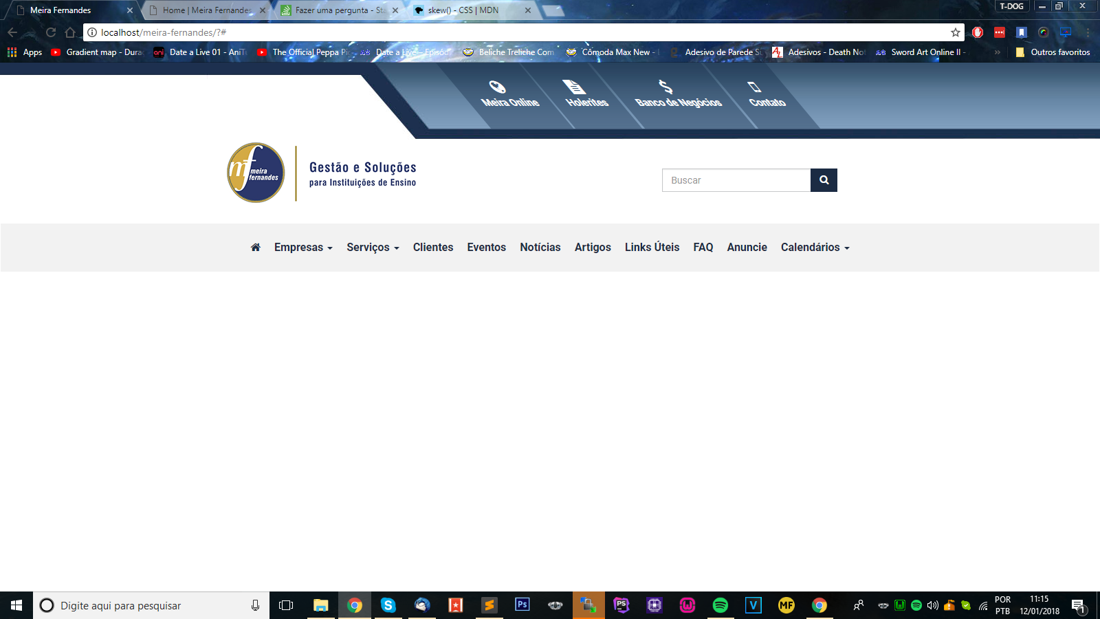 until the menu text applies this effect and gets distorted how do I solve it?