Beveled edge transparenet with css only

2

There is a simple way to make a beveled border with only CSS, but transparent. No need for svg, png, etc?

SeewhatI'vedonesofar: link
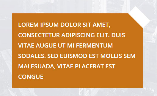
.home_fundo{
   width: 300px;
   height: auto;
   background: url(http://www.simi.org.br/files/Janeiro%20-%202017/11096.jpg);
}
.home_banner_caixa {
  width: 200px;
  max-width: 400px;
  height: auto;
  position: relative;
  background-color: #c77316;
  padding: 20px;
  font-size: 12px;
  color: #ffffff;
}

.home_banner_caixa_chanfro {
  width: 70px;
  height: 70px;
  position: absolute;
  top: -10px;
  right: -10px;
  -ms-transform: rotate(45deg);
  -webkit-transform: rotate(45deg);
  -moz-transform: rotate(45deg);
  transform: rotate(45deg);
}

.home_banner_caixa_chanfro1 {
  width: 70px;
  height: 35px;
  display: block;
  background-color: #ffffff;
}

.home_banner_caixa_chanfro2 {
  width: 70px;
  height: 35px;
  display: block;
  background-color: #c77316;
}
<div class="home_fundo">
  <div class="home_banner_caixa">
    <div class="home_banner_caixa_chanfro">
      <div class="home_banner_caixa_chanfro1"></div>
      <div class="home_banner_caixa_chanfro2"></div>
    </div>
    <h1>
      Lorem ipsum
      <br> dolor sit amet, consectetur adipiscing elit. Duis vitae augue ut mi fermentum sodales. Sed euismod est mollis sem malesuada, vitae placerat est congue
    </h1>
  </div>
</div>

Notice that the bank corner should be transparent, I thought there might be some kind of jquery mask to make the white bevel div transparent, or something like that ... can you help me?

    
asked by anonymous 05.03.2018 / 18:47

1 answer

2

For Images

In case you need to crop the corner of an image with CSS, or edit an image with CSS you can see here: Make effects on CSS edges, such as bevel

For solid core

There are a few different options, I'll address 3 of them.

Option 1

Most current option with linear-gradiente . The technique is to make a linear-gradiente in 45deg , where the last portion referring to 10% of the gradient is transparent. So we will have a solid color from 0% to 90% and from 90% to 100% transparent color .

body {
    background-image: linear-gradient(to left, blue, green);
}
.container {
    width: 200px;
    height: 100px;
    background-image: linear-gradient(45deg, #f00 0%, #f00 90%, rgba(0,0,0,0) 90%, rgba(0,0,0,0) 100%);
}

    
<div class="container"></div>

Option 2

I made this option using pseudo elements ::before and ::after plus transform: skewX(45deg); so the corner of div is "transparent" different from the other options of the answer marked as Duplicate ...

html, body {
    width: 100%;
    height: 100%;
    margin: 0;
    padding: 0;
}
body {
    background-image: url(http://placecage.com/420/320);
    background-size: cover;
    display: flex;
    position: relative;
}
.container {
    background-color: tomato;
    position: relative;
    margin: auto;
    width: 200px;
    height: 100px;
}
.container::after {
    content: "";
    top: -20px;
    left: -10px;
    height: 20px;
    width: 100%;
    background-color: tomato;
    position: absolute;
    transform: skewX(45deg);
}
.container::before {
    content: "";
    bottom: 0px;
    left: -20px;
    height: calc(100% + 20px);
    width: 20px;
    background-color: tomato;
    position: absolute;
}
<div class="container">Meu texto aqui! Meu texto aqui! Meu texto aqui!</div>

Edit

Option 100% Crossbrowser: (the code is uglier, but works in all browsers)

html, body {
    width: 100%;
    height: 100%;
    margin: 0;
    padding: 0;
}
body {
    background-image: url(http://placecage.com/460/320);
    background-size: cover;
    display: flex;
    position: relative;
}
.container {
    background-color: limegreen;
    position: relative;
    margin: auto;
    width: 200px;
    height: 100px;
    padding: 0 10px 10px;
    box-sizing: border-box;
}
.barra {
    width: 180px;
    height: 20px;
    position: absolute;
    left: 0;
    top: -20px;
    background-color: limegreen;
}
.box {
    box-sizing: border-box;
    width: 20px;
    height: 20px;
    position: absolute;
    right: 0;
    top: -20px;
    border-left: 10px solid limegreen;
    border-bottom: 10px solid limegreen;
    border-top: 10px solid transparent;
    border-right: 10px solid transparent;
}
<div class="container">
    <div class="barra"></div>
    <div class="box"></div>
    Meu texto aqui! Meu texto aqui! Meu texto aqui!
</div>

Tip: In this technique I used bordas with transparent colors and position:absolut with top negativo

    
06.03.2018 / 20:23