Balloons with tips to use the system (Tour)

6

What I want is to know the name given to those tips that are appearing to assist in using a system when we first enter it.

For example, I log in to the system and a balloon appears as if it were a modal in a certain location with a hint and a close button or move to the next hint.

I need to implement this in a PHP system (Laravel 5), if you have any project in github or something like that, it would help a lot, but as I do not even know the exact name is difficult to find.

Type this here:

    
asked by anonymous 06.12.2016 / 17:33

3 answers

6

Giving a researched, I came to the conclusion that this is called Tour .

Tour can use different types of dialogs, such as Modals or Tooltips .

  • Modals are those dialogues that require attention to user action .
  • Tooltips are small balloons with information or actions for the user. In my opinion, unlike modal, this does not prevent the user from continuing to interact with the page, even though it is open.

For those who use Bootstrap, I found the Bootstrar Tour , which has a very similar system to the one shown in the question.

I also found the Product Tour .

Demo:

The latter seems to be more independent than the one previously shown, since it requires Bootstrap.

    
07.12.2016 / 12:30
4
  

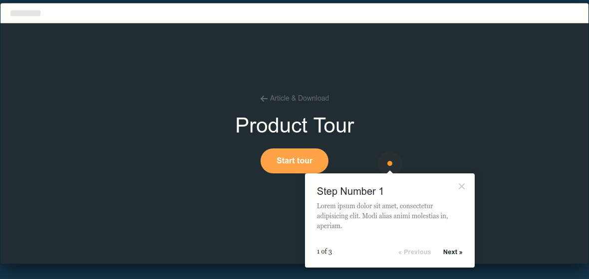
Note that in addition to the name "tour" can be called step-by-step guide (step by step guide), search terms such as hightlight intro can help too

@renan has indicated the link , its use is practical, just use the attributes:

  • % with numeric value, to say when it should appear, whether 1 is the first, if 2 is the second, and so on, this parameter is optional and only serves to guarantee the order you want to be displayed
  • data-step="" contains the text with the guidelines
  • data-intro="" , where the tooltip should appear, possible values:

    • data-position="" to the left of the pointing element
    • left to the right of the pointing element
    • right above the pointing element
    • top below the pointed element

For example:

<div class="profile" data-step="1" data-intro="Aqui tem os dados do seu perfil">
..
</div>

<div class="notifications" data-step="2" data-intro="Aqui contem as notificações, também é exibido &quot;pushs&quot; informando sobre novas notifiações">
..
</div>

<div class="apps" data-step="3" data-intro="Aqui contem todos apps mais usados">
..
</div>

To start the tour you need to run the script bottom , you can do this:

document.getElementById("iniciar-tour").onclick = function() {
    introJs().start(); 
};

html:

<button id="iniciar-tour">Como usar</button>

Or onload:

window.onload = function () {
    introJs().start();
};
  

To download go to the link

Example:

window.onload = function () {
    introJs().start();
};
html, body {
    margin: 0;
    padding: 0;
}

.profile, .notifications, .apps {
    height: 26px;
    margin: 50px;
    background: #fc0;
}
<link href="https://cdnjs.cloudflare.com/ajax/libs/intro.js/2.3.0/introjs.min.css" rel="stylesheet"/>
<script src="https://cdnjs.cloudflare.com/ajax/libs/intro.js/2.3.0/intro.min.js"></script><divclass="profile" data-step="1" data-intro="Aqui tem os dados do seu perfil">
...
</div>

<div class="notifications" data-step="2" data-intro="Aqui contem as notificações, também é exibido &quot;pushs&quot; informando sobre novas notificações">
...
</div>

<div class="apps" data-step="3" data-intro="Aqui contem todos apps mais usados">
...
</div>
    
08.12.2016 / 16:05
0

A very simple example for your tooltip. Then it's just shaping the css to your liking.

 a.tooltips {
          position: relative;
          display: inline;
        }
        a.tooltips span {
          position: absolute;
          width:140px;
          color: #FFFFFF;
          background: #000000;
          height: 30px;
          line-height: 30px;
          text-align: center;
          visibility: hidden;
          border-radius: 6px;
          box-shadow: -1px 0px 0px #800000;
        }
        a.tooltips span:after {
          content: '';
          position: absolute;
          top: 100%;
          left: 50%;
          margin-left: -8px;
          width: 0; height: 0;
          border-top: 8px solid #000000;
          border-right: 8px solid transparent;
          border-left: 8px solid transparent;
        }
        a:hover.tooltips span {
          visibility: visible;
          opacity: 0.8;
          bottom: 30px;
          left: 50%;
          margin-left: -76px;
          z-index: 999;
        }
<br>
<br>
<br>
<br>
<br>

<a class="tooltips" href="#">Exemplo
<span>Tooltip</span></a>
    
07.12.2016 / 12:48