box-shadow pick up the four corners of the image

6

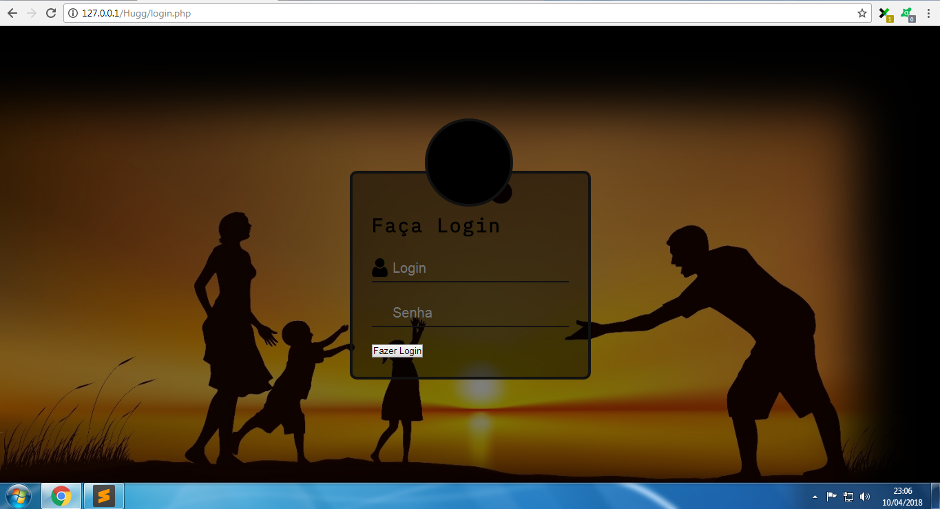
Can anyone tell me how I leave box-shadow in the same key on the right and top on the left and bottom? link

HTML:

<divid="wrapper_login" class="fixed"></div>

CSS:

<style type="text/css">
body {
    font-family: 'IBM Plex Mono', monospace;
    font-size: 14px;
    letter-spacing: 2px;
    background: url(../images/bg.jpg) no-repeat center center fixed;
    -webkit-background-size: cover;
    -moz-background-size: cover;
    background-size: cover;
}
.fixed {
     position: fixed;
}
#wrapper_login {
    width: 100%;
    height: 100%;
    background-color: rgba(0,0,0,0.5);
    box-shadow: inset -120px 120px 120px #000;
}
</style>
    
asked by anonymous 11.04.2018 / 04:00

2 answers

4

Complementing @hugocsl's colleague's answer, you have a fourth parameter besides the blur, which may be interesting for you. It tells you how much the shadow will "advance" before beginning the blur transition, definitely leaving solid (or with the initial transparency) the color up to that point.

For comparison purposes, I used exactly the same code as my colleague, but I added the fourth parameter (I overdid it a bit so you can see the difference), and lessen the blur a bit:

body {
    font-family: 'IBM Plex Mono', monospace;
    font-size: 14px;
    letter-spacing: 2px;
    background: url(http://placecage.com/510/380) no-repeat center center fixed;
    -webkit-background-size: cover;
    -moz-background-size: cover;
    background-size: cover;
    margin:0;
}
.fixed {
     position: fixed;
}
#wrapper_login {
    width: 100%;
    height: 100%;
    background-color: rgba(0,0,0,0.5);
    box-shadow: inset 0 0 30px 50px #000;
    /* ajustar aqui o avanço ---^      */
}
<div id="wrapper_login" class="fixed"></div>
    
11.04.2018 / 11:43
6

What happens is that the first two values of Box-Shadown represent the axis X and Y

/* offset-x | offset-y | blur-radius | color */
box-shadow: -120px 120px 120px #000;

So as you want the shadow to grow in all directions equally, you should not move the horizontal and vertical axes (-120px 120px) , just keep them with the valor 0 , and you only work with Blur which is the third value. box-shadow: inset 0 0 120px #000

See below how your code is with X and Y on 0

body {
    font-family: 'IBM Plex Mono', monospace;
    font-size: 14px;
    letter-spacing: 2px;
    background: url(http://placecage.com/510/380) no-repeat center center fixed;
    -webkit-background-size: cover;
    -moz-background-size: cover;
    background-size: cover;
    margin:0;
}
.fixed {
     position: fixed;
}
#wrapper_login {
    width: 100%;
    height: 100%;
    background-color: rgba(0,0,0,0.5);
    box-shadow: inset 0 0 120px #000;
}
<div id="wrapper_login" class="fixed"></div>
  • Read more about the Box-Shadown property here: link
11.04.2018 / 04:12