Full-Width Image Grid / Container with Semantic-UI

1

I know the question is a bit abstract, but how to do it:

With Semantic-UI ?

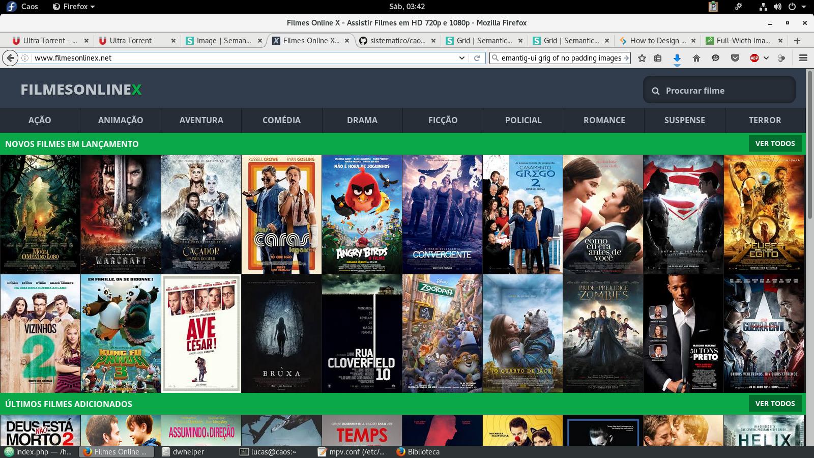
That is, a set of borderless and borderless thumbs, occupying 100% of the width and responsive way?

I did here , but it was not very cool, you had a space on the right side.

CSS

.capa {
  margin: 0!important;
  width: auto!important;
  height: 220px!important;
}

HTML

<div class="ui main fluid container">
  <div class="ui blue inverted segment divisor">
    <h4>Lançamentos</h4>
  </div>
  <div class="ui small images">
    <a href="tocar.php?id=276">
      <img class="capa" src="imagem.jpg">
    </a>
  </div><!-- Fim Image Group -->
</div><!-- Fim Container -->

Thank you in advance.

EDITED

Unfortunately I changed Semantic-UI by Twitter Bootstrap 4 for not being able to solve.

Your colleague's help was unprecedented!

HTML

<div class="container-fluid">
  <div class="row">
    <div class="col-xs-1 no-margin">
      <a href="tocar.php?id={$info[0]}">
        <img src="{$info[5]}" width="100%" class="capa" />
      </a>
    </div>
  </div><!-- Row -->
</div><!-- Container -->

CSS

.row .no-margin {
  margin: 0;
  padding: 0;
}

.capa {
  max-height: 220px;
}
    
asked by anonymous 20.08.2016 / 09:54

1 answer

2

Give the bootstrap. Now it's just a matter of adjusting the sizes you need.

.row .no-margin {
    margin: 0;
    padding: 0;
}

.row.cover-list {
  margin-right: 0;
  margin-left: 0;
}
<link href="https://maxcdn.bootstrapcdn.com/bootstrap/3.3.7/css/bootstrap.min.css" rel="stylesheet"/>
<div class="row cover-list">
    <div class="col-xs-2 no-margin">
        <img src="http://placehold.it/150x350"width="100%" class="img-responsive" />
    </div>
    <div class="col-xs-2 no-margin">
        <img src="http://placehold.it/150x350"width="100%" class="img-responsive" />
    </div>
    <div class="col-xs-2 no-margin">
        <img src="http://placehold.it/150x350"width="100%" class="img-responsive" />
    </div>
    <div class="col-xs-2 no-margin">
        <img src="http://placehold.it/150x350"width="100%" class="img-responsive" />
    </div>
    <div class="col-xs-2 no-margin">
        <img src="http://placehold.it/150x350"width="100%" class="img-responsive" />
    </div>
    <div class="col-xs-2 no-margin">
        <img src="http://placehold.it/150x350"width="100%" class="img-responsive" />
    </div>
    <div class="col-xs-2 no-margin">
        <img src="http://placehold.it/150x350"width="100%" class="img-responsive" />
    </div>
    <div class="col-xs-2 no-margin">
        <img src="http://placehold.it/150x350"width="100%" class="img-responsive" />
    </div>
    <div class="col-xs-2 no-margin">
        <img src="http://placehold.it/150x350"width="100%" class="img-responsive" />
    </div>
    <div class="col-xs-2 no-margin">
        <img src="http://placehold.it/150x350"width="100%" class="img-responsive" />
    </div>
    <div class="col-xs-2 no-margin">
        <img src="http://placehold.it/150x350"width="100%" class="img-responsive" />
    </div>
    <div class="col-xs-2 no-margin">
        <img src="http://placehold.it/150x350"width="100%" class="img-responsive" />
    </div>
</div>
    
20.08.2016 / 17:38