Align and place div over the other

1

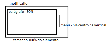
Well I created a div called 'notification'. Where I will put a text and at the end of it has a menu. Everything is working fine, however when the text is too large and the screen is small, the menu button is over the text, and it is not aligned in the vertical center. Does anyone know how to fix this?

In some cases the 'notification' div will not have the menu.

$(document).ready(function() {

  // Abre Sidenav
  $(".overflow-menu").click(function() {
    $(this).find("ul").animate({
      height: 'toggle'
    }, 'fast');
  });
});
/*====================================================================================================================*/

/* Over-Flow Menu */

/*====================================================================================================================*/

.container-head .overflow-menu .material-icons {
  padding-right: 20px;
}
.container-head .overflow-menu {
  vertical-align: middle;
  display: table-cell;
  vertical-align: middle;
  width: 24px;
  position: relative;
  cursor: pointer;
}
.notification .overflow-menu {
  margin-right: 5px;
  float: right;
  margin-top: -4px;
  display: table-cell;
  vertical-align: middle;
  width: 24px;
  position: relative;
  cursor: pointer;
}
.overflow-menu ul {
  padding: 0;
  position: absolute;
  width: 260px;
  display: none;
  margin-left: -196px;
  overflow: hidden;
  border-radius: 0px 0px 4px 4px;
  top: 50px;
}
.notification .overflow-menu ul {
  text-align: left;
  font-style: normal;
  top: 22px;
  margin-left: -220px;
}
.overflow-menu li {
  padding-left: 10px;
  line-height: 40px;
  cursor: pointer;
  color: #FFFFFF;
  background: #484848;
}
.overflow-menu li:hover {
  background: #0091FF;
}
/*====================================================================================================================*/

/* Notification */

/*====================================================================================================================*/

.notification {
  background: #0091FF;
  padding: 15px;
  color: #FFFFFF;
  font-style: italic;
  text-a
}
lign:center;
<script src="https://ajax.googleapis.com/ajax/libs/jquery/2.1.1/jquery.min.js"></script><linkhref="https://fonts.googleapis.com/icon?family=Material+Icons" rel="stylesheet">
<!-- Notification -->
<div class="notification">
  <b>título</b> texto kjh jkkj k hk gh jghjgjk g jh jhgk hjg gkj hgj hg jhgj kjhgg jkhg jhg jg jhg j gjh gj g jhg j

  <!-- Over-Flow Menu -->
  <div class='overflow-menu'>
    <i class="material-icons">more_vert</i>
    <ul>
      <li>OPÇÃO 1</li>
      <li>OPÇÃO 2</li>
      <li>OPÇÃO 3</li>
    </ul>
  </div>
</div>
    
asked by anonymous 29.12.2016 / 11:57

3 answers

2

Changing only the HTML order that is written solves the problem.

$(document).ready(function() {

  // Abre Sidenav
  $(".overflow-menu").click(function() {
    $(this).find("ul").animate({
      height: 'toggle'
    }, 'fast');
  });
});
/*====================================================================================================================*/

/* Over-Flow Menu */

/*====================================================================================================================*/

.container-head .overflow-menu .material-icons {
  padding-right: 20px;
}
.container-head .overflow-menu {
  vertical-align: middle;
  display: table-cell;
  vertical-align: middle;
  width: 24px;
  position: relative;
  cursor: pointer;
}
.notification .overflow-menu {
  margin-right: 5px;
  float: right;
  margin-top: -4px;
  display: table-cell;
  vertical-align: middle;
  width: 24px;
  position: relative;
  cursor: pointer;
}
.overflow-menu ul {
  padding: 0;
  position: absolute;
  width: 260px;
  display: none;
  margin-left: -196px;
  overflow: hidden;
  border-radius: 0px 0px 4px 4px;
  top: 50px;
}
.notification .overflow-menu ul {
  text-align: left;
  font-style: normal;
  top: 22px;
  margin-left: -220px;
}
.overflow-menu li {
  padding-left: 10px;
  line-height: 40px;
  cursor: pointer;
  color: #FFFFFF;
  background: #484848;
}
.overflow-menu li:hover {
  background: #0091FF;
}
/*====================================================================================================================*/

/* Notification */

/*====================================================================================================================*/

.notification {
  background: #0091FF;
  padding: 15px;
  color: #FFFFFF;
  font-style: italic;
  text-a
}
lign:center;
<script src="https://ajax.googleapis.com/ajax/libs/jquery/2.1.1/jquery.min.js"></script><linkhref="https://fonts.googleapis.com/icon?family=Material+Icons" rel="stylesheet">
 
<!-- Notification -->
<div class="notification">
  <!-- Over-Flow Menu -->
  <div class='overflow-menu'>
    <i class="material-icons">more_vert</i>
    <ul>
      <li>OPÇÃO 1</li>
      <li>OPÇÃO 2</li>
      <li>OPÇÃO 3</li>
    </ul>
  </div>
  <b>título</b>  texto kjh jkkj k hk gh jghjgjk g jh jhgk hjg gkj hgj hg jhgj     kjhgg jkhg jhg jg jhg j gjh gj g jhg j
</div>
    
29.12.2016 / 12:20
0

I do not quite understand what you need, but there is something I did thinking about what I understood.

I made with float:right and left .

$(document).ready(function() {

  // Abre Sidenav
  $(".overflow-menu").click(function() {
    $(this).find("ul").animate({
      height: 'toggle'
    }, 'fast');
  });
});
/*====================================================================================================================*/

/* Over-Flow Menu */

/*====================================================================================================================*/

.container-head .overflow-menu .material-icons {
  padding-right: 20px;
}
.container-head .overflow-menu {
  vertical-align: middle;
  display: table-cell;
  vertical-align: middle;
  width: 24px;
  position: relative;
  cursor: pointer;
}
.notification .overflow-menu {
  margin-right: 5px;
  margin-top: -4px;
  display: table-cell;
  vertical-align: middle;
  width: 24px;
  float: right;
  cursor: pointer;
}
.overflow-menu ul {
  padding: 0;
  position: absolute;
  width: 260px;
  display: none;
  margin-left: -196px;
  overflow: hidden;
  border-radius: 0px 0px 4px 4px;
  top: 50px;
}
.notification .overflow-menu ul {
  text-align: left;
  font-style: normal;
  top: 22px;
  margin-left: -220px;
}
.overflow-menu li {
  padding-left: 10px;
  line-height: 40px;
  cursor: pointer;
  color: #FFFFFF;
  background: #484848;
}
.overflow-menu li:hover {
  background: #0091FF;
}
/*====================================================================================================================*/

/* Notification */

/*====================================================================================================================*/

.notification {
  background: #0091FF;
  padding: 15px;
  color: #FFFFFF;
  font-style: italic;
  display: table;
  position: relative;
}
.notification .not {
  float: left;
  width: 90%;
}
.notification h4 {
  margin: 0;
  margin-bottom: 5px;
  right: 15px;
  top: 15px;
}
.notification .texto {
  width: 100%;
}
<script src="https://ajax.googleapis.com/ajax/libs/jquery/2.1.1/jquery.min.js"></script><linkhref="https://fonts.googleapis.com/icon?family=Material+Icons" rel="stylesheet">
<!-- Notification -->
<div class="notification">
  <div class="not">
    <h4>Título</h4>
    <div class="texto">
      Lorem ipsum dolor sit amet, consectetur adipisicing elit, sed do eiusmod tempor incididunt ut labore et dolore magna aliqua. Ut enim ad minim veniam, quis nostrud exercitation ullamco laboris nisi ut aliquip ex ea commodo consequat.
    </div>
  </div>

  <!-- Over-Flow Menu -->
  <div class='overflow-menu'>
    <i class="material-icons">more_vert</i>
    <ul>
      <li>OPÇÃO 1</li>
      <li>OPÇÃO 2</li>
      <li>OPÇÃO 3</li>
    </ul>
  </div>
</div>
    
29.12.2016 / 12:13
0

I propose to insert a paragraph inside the notificaion element and set a size for it, such that I left it with 90% . So I changed some things in the .notification .overflow-menu and .notification classes, where I left the .notification display class as table to leave this element and the descendants in table format and .notification .overflow-menu with size 5% . So regardless of the size of the text, the menu will always be to the right of the text and in the center.

Result:

$(document).ready(function() {

  // Abre Sidenav
  $(".overflow-menu").click(function() {
    $(this).find("ul").animate({
      height: 'toggle'
    }, 'fast');
  });
});
/*====================================================================================================================*/

/* Over-Flow Menu */

/*====================================================================================================================*/

.container-head .overflow-menu .material-icons {
  padding-right: 20px;
}
.container-head .overflow-menu {
  vertical-align: middle;
  display: table-cell;
  vertical-align: middle;
  width: 24px;
  position: relative;
  cursor: pointer;
}
.notification .overflow-menu {
  margin-right: 5px;
  display: table-cell;
  vertical-align: middle;
  width: 5%;
  position: relative;
  cursor: pointer;
}
.overflow-menu ul {
  padding: 0;
  position: absolute;
  width: 260px;
  display: none;
  margin-left: -196px;
  overflow: hidden;
  border-radius: 0px 0px 4px 4px;
  top: 50px;
}
.notification .overflow-menu ul {
  text-align: left;
  font-style: normal;
  top: 22px;
  margin-left: -220px;
}
.overflow-menu li {
  padding-left: 10px;
  line-height: 40px;
  cursor: pointer;
  color: #FFFFFF;
  background: #484848;
}
.overflow-menu li:hover {
  background: #0091FF;
}
/*====================================================================================================================*/

/* Notification */

/*====================================================================================================================*/

.notification {
  background: #0091FF;
  padding: 15px;
  color: #FFFFFF;
  font-style: italic;
  text-align:center;
  display: table;
}

.notification p {
  width: 90%;
}
<script src="https://ajax.googleapis.com/ajax/libs/jquery/2.1.1/jquery.min.js"></script><linkhref="https://fonts.googleapis.com/icon?family=Material+Icons" rel="stylesheet">
<!-- Notification -->
<div class="notification">
  <p>
    <b>Lorem Ipsum</b> Lorem ipsum dolor sit amet, consectetur adipiscing elit. Vivamus id sem ac eros bibendum dignissim. In dignissim, orci commodo aliquet vestibulum, urna libero varius augue, ut pellentesque libero odio nec arcu. Donec hendrerit gravida sem et venenatis. Maecenas finibus elementum sapien, a faucibus erat lacinia in. Suspendisse volutpat massa nibh, sit amet maximus nulla sagittis ac. Duis maximus libero elementum, iaculis quam vitae, ornare nunc. Quisque efficitur erat justo, sit amet aliquam felis finibus non. Phasellus laoreet dolor ligula, at condimentum enim lacinia ac. 
  </p>
  <!-- Over-Flow Menu -->
  <div class='overflow-menu'>
    <i class="material-icons">more_vert</i>
    <ul>
      <li>OPÇÃO 1</li>
      <li>OPÇÃO 2</li>
      <li>OPÇÃO 3</li>
    </ul>
  </div>
</div>
    
29.12.2016 / 12:22