Dropdown with right image

7

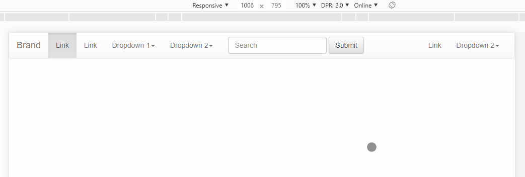
I'm using Bootstrap to make a bar at the top of the page, and I'm having a problem:

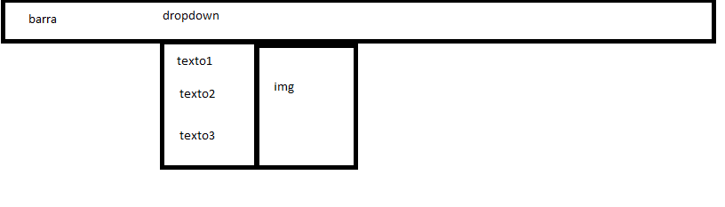
What I need is to open the dropdown, have a list of options, and an image next to it that always has the same size as the list below.

I achieved this by setting a fixed height and width in the image, however the list can grow and I can not change it in the hand.

One solution that would work is to put a div involving the list and the image, and set the image size to 100%, however doing so, the dropdown is no longer activated (I think I end up breaking the structure that the bootstrap use to enable the dropdown).

How can I reach this solution?

Thank you!

<divid="navbar" class="collapse navbar-collapse" id="bs-example-navbar-collapse-1">
            <ul class="nav navbar-nav top-elements">
                <li id="dropdown-produtos" class="dropdown">
                    <a href="#" class="dropdown-toggle text-uppercase top-text" data-toggle="dropdown" role="button" aria-haspopup="true" aria-expanded="false">Nossos Produtos<span class="caret top-caret"></span></a>
<!-- a div ia aqui --> <ul class="dropdown-menu dropdown-menu-produtos">
                        <li class="dropdown-item-active">
                            <a href="#" class="dropdown-item-description">texto1</a>
                            <ul class="dropdown-menu img-dropdown">
                                 <img src="assets/img.png"> 
                            </ul>
                        </li>
                        <li class="dropdown-item">
                            <a href="#" class="dropdown-item-description">texto2</a>
                        </li>
                        <li class="dropdown-item"><a href="#" class="dropdown-item-description">texto3</a></li>
                        <li class="dropdown-item"><a href="#" class="dropdown-item-description">texto4</a></li>
                        <li class="dropdown-item"><a href="#" class="dropdown-item-description">texto5</a></li>
                    </ul>
                </li>
            </ul>
</div>
    
asked by anonymous 18.09.2015 / 19:58

1 answer

1

I'm tired of seeing this unanswered question ... so here's an option.

The idea is to have in the dropdown two lists, one with the Menu, and another only with the image, using display:flex in the container of this Menu you will have the list of items of one side and the left image, this image is actually a background-image and will always occupy the entire height of the menu, no matter how many items it has inside.

Tounderstandbetterseethecodereferringtotheimageabove.

OBS:Displayin"All Page" to get a better result, although tb works fine in the Mobile Menu.

<!DOCTYPE html>
<html lang="en">
<head>
  <meta charset="utf-8" />
  <meta http-equiv="X-UA-Compatible" content="IE=edge">
  <title>Page Title</title>
  <meta name="viewport" content="width=device-width, initial-scale=1">
  <link rel="stylesheet" type="text/css" media="screen" href="https://maxcdn.bootstrapcdn.com/bootstrap/3.3.7/css/bootstrap.min.css" />
  <link rel="stylesheet" type="text/css" media="screen" href="https://maxcdn.bootstrapcdn.com/bootstrap/3.3.7/css/bootstrap-theme.min.css" />
  <link rel="stylesheet" type="text/css" media="screen" href="https://maxcdn.bootstrapcdn.com/font-awesome/4.7.0/css/font-awesome.min.css" />
<style>
  .dropdown.open .dropdown-menu.teste {
    display: flex;
    padding: 0;
  }
  .dropdown.open .dropdown-menu li ul {
    padding: 5px 0;
    margin: 2px 0 0;
    font-size: 14px;
    text-align: left;
    list-style: none;
  }
  .dropdown.open .dropdown-menu li ul li a{
    display: block;
    padding: 3px 20px;
    clear: both;
    font-weight: 400;
    line-height: 1.42857143;
    color: #333;
    white-space: nowrap;
  }

  .dropdown.open .dropdown-menu.teste .imagem {
    width: 100px;
    background-image: url(https://placecage.com/100/100);
    background-size: cover;
    background-position: center;
    background-repeat: no-repeat;
  }
  .dropdown.open .dropdown-menu.teste .imagem.murray {
    background-image: url(https://fillmurray.com/100/100);
  }

</style>
</head>
<body>
  
    <nav class="navbar navbar-default">
        <div class="container-fluid">
          <!-- Brand and toggle get grouped for better mobile display -->
          <div class="navbar-header">
            <button type="button" class="navbar-toggle collapsed" data-toggle="collapse" data-target="#bs-example-navbar-collapse-1" aria-expanded="false">
              <span class="sr-only">Toggle navigation</span>
              <span class="icon-bar"></span>
              <span class="icon-bar"></span>
              <span class="icon-bar"></span>
            </button>
            <a class="navbar-brand" href="#">Brand</a>
          </div>
      
          <!-- Collect the nav links, forms, and other content for toggling -->
          <div class="collapse navbar-collapse" id="bs-example-navbar-collapse-1">
            <ul class="nav navbar-nav">
              <li class="active"><a href="#">Link <span class="sr-only">(current)</span></a></li>
              <li><a href="#">Link</a></li>
              <li class="dropdown">
                <a href="#" class="dropdown-toggle" data-toggle="dropdown" role="button" aria-haspopup="true" aria-expanded="false">Dropdown 1<span class="caret"></span></a>
                <ul class="dropdown-menu teste">
                  <li>
                    <ul>
                      <li><a href="#">Action</a></li>
                      <li><a href="#">Another action</a></li>
                      <li><a href="#">Something else here</a></li>
                      <li role="separator" class="divider"></li>
                      <li><a href="#">Separated link</a></li>
                      <li role="separator" class="divider"></li>
                      <li><a href="#">One more separated link</a></li>
                    </ul>
                  </li>
                  <li class="imagem"></li>
                </ul>
              </li>
              <li class="dropdown">
                <a href="#" class="dropdown-toggle" data-toggle="dropdown" role="button" aria-haspopup="true" aria-expanded="false">Dropdown 2<span class="caret"></span></a>
                <ul class="dropdown-menu teste">
                  <li>
                    <ul>
                      <li><a href="#">Action</a></li>
                      <li role="separator" class="divider"></li>
                      <li><a href="#">Separated link</a></li>
                      <li role="separator" class="divider"></li>
                      <li><a href="#">One more separated link</a></li>
                    </ul>
                  </li>
                  <li class="imagem murray"></li>
                </ul>
              </li>
            </ul>
            <form class="navbar-form navbar-left">
              <div class="form-group">
                <input type="text" class="form-control" placeholder="Search">
              </div>
              <button type="submit" class="btn btn-default">Submit</button>
            </form>
            <ul class="nav navbar-nav navbar-right">
              <li><a href="#">Link</a></li>
              <li class="dropdown">
                <a href="#" class="dropdown-toggle" data-toggle="dropdown" role="button" aria-haspopup="true" aria-expanded="false">Dropdown 2<span class="caret"></span></a>
                <ul class="dropdown-menu">
                  <li><a href="#">Action</a></li>
                  <li><a href="#">Another action</a></li>
                  <li><a href="#">Something else here</a></li>
                  <li role="separator" class="divider"></li>
                  <li><a href="#">Separated link</a></li>
                </ul>
              </li>
            </ul>
          </div><!-- /.navbar-collapse -->
        </div><!-- /.container-fluid -->
      </nav>
  
  <script src="https://code.jquery.com/jquery-3.2.1.min.js"></script><scriptsrc="https://maxcdn.bootstrapcdn.com/bootstrap/3.3.7/js/bootstrap.min.js"></script>
</body>
</html>
    
21.12.2018 / 20:18