Redimensional Input Bootstrap in Form Inline

1

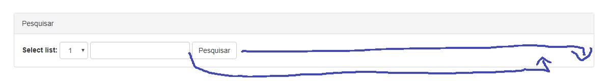
I have the following form inline, and would like to resize the input as per the drawing:

Followthecodebelow:

<divclass="row">
<div class="col-lg-12">
  <div class="panel panel-default">
    <div class="panel-heading">Pesquisar</div>
    <div class="panel-body">

      <form class="form-inline ">
        <div class="form-group">
          <div class="form-group">
            <label for="sel1">Select list:</label>
            <select class="form-control" id="sel1">
              <option>1</option>
              <option>2</option>
              <option>3</option>
              <option>4</option>
            </select>
          </div>
        </div>
        <input type="text" class="form-control" id="campoPesquisa">
        <button type="submit" class="btn btn-default">Pesquisar</button>
      </form>

    </div>
  </div>
</div>

I've tried putting it inside a row, out of row. Beginner's Doubt.

    
asked by anonymous 08.08.2017 / 20:25

2 answers

1

Old I've managed to resolve by dividing the width of each inline element and applying inline-block to them. Remembering that, never let in 100% otherwise it will automatically break line. !important is required because it overrides Bootstrap style.

Remembering that the button is responsive, that is, it gets bigger as you decrease or increase the screen.

.form-group label{
  width:15% !important;
  display:inline-block;
}

.form-group select{
  width:25% !important;
  display:inline-block;
}

.form-group input[type="text"]{
  width:35% !important;
  display:inline-block;
}

.form-group button[type="submit"]{
  width:20% !important;
  display:inline-block;
}

.form-group{

width:100%;

}
<script src="https://ajax.googleapis.com/ajax/libs/jquery/2.1.1/jquery.min.js"></script><!--LatestcompiledandminifiedCSS--><linkrel="stylesheet" href="https://maxcdn.bootstrapcdn.com/bootstrap/3.3.7/css/bootstrap.min.css" integrity="sha384-BVYiiSIFeK1dGmJRAkycuHAHRg32OmUcww7on3RYdg4Va+PmSTsz/K68vbdEjh4u" crossorigin="anonymous">

<!-- Optional theme -->
<link rel="stylesheet" href="https://maxcdn.bootstrapcdn.com/bootstrap/3.3.7/css/bootstrap-theme.min.css" integrity="sha384-rHyoN1iRsVXV4nD0JutlnGaslCJuC7uwjduW9SVrLvRYooPp2bWYgmgJQIXwl/Sp" crossorigin="anonymous">

<!-- Latest compiled and minified JavaScript -->
<script src="https://maxcdn.bootstrapcdn.com/bootstrap/3.3.7/js/bootstrap.min.js"integrity="sha384-Tc5IQib027qvyjSMfHjOMaLkfuWVxZxUPnCJA7l2mCWNIpG9mGCD8wGNIcPD7Txa" crossorigin="anonymous"></script>

<div class="row">
<div class="col-lg-12">
  <div class="panel panel-default">
    <div class="panel-heading">Pesquisar</div>
    <div class="panel-body">
      <form class="form-inline ">
        <div class="form-group">
            <label for="sel1">Select list:</label>
            <select class="form-control" id="sel1">
              <option>1</option>
              <option>2</option>
              <option>3</option>
              <option>4</option>
            </select>
            <input type="text" class="form-control" id="campoPesquisa">
            <button type="submit" class="btn btn-default" >Pesquisar</button>
          </div>
      </form>

    </div>
  </div>
</div>
    
08.08.2017 / 20:45
1

Opa Brother, easy?

Well there are lots of ways, I'll show you one that I use, that only you will use your own Bootstrap class!

What would be Offsetting columns!

Is it important that you remember the grid concept that is used in bootstrap, bele?

In your code it would look like this:

<div class="row">
<div class="col-lg-12">
  <div class="panel panel-default">
    <div class="panel-heading">Pesquisar</div>
    <div class="panel-body">

      <form class="form-inline col-lg-offset-7">
        <div class="form-group">
          <div class="form-group">
            <label for="sel1">Select list:</label>
            <select class="form-control" id="sel1">
              <option>1</option>
              <option>2</option>
              <option>3</option>
              <option>4</option>
            </select>
          </div>
        </div>
        <input type="text" class="form-control" id="campoPesquisa">
        <button type="submit" class="btn btn-default">Pesquisar</button>
      </form>

    </div>
  </div>
</div> 

Note that inside the form class, I put the col-lg-offset-7, which would basically be a left margin through the grid, ie, that column skips 7 blocks to the right side!

And the cool thing is that it maintains the responsiveness of the project!

As I said, there are countless ways to do this, this is the one I like to use!

Edit: In case of resizing the input is simple too: Just add a class in the input and move the width:

<input type="text" class="form-control input-custom"id="campoPesquisa">

and in css put something like this:

.input-custom {width: 75%;}

And adjust the percentage according to your need

    
08.08.2017 / 20:41