Vertically center div container on the Bootstrap page

7

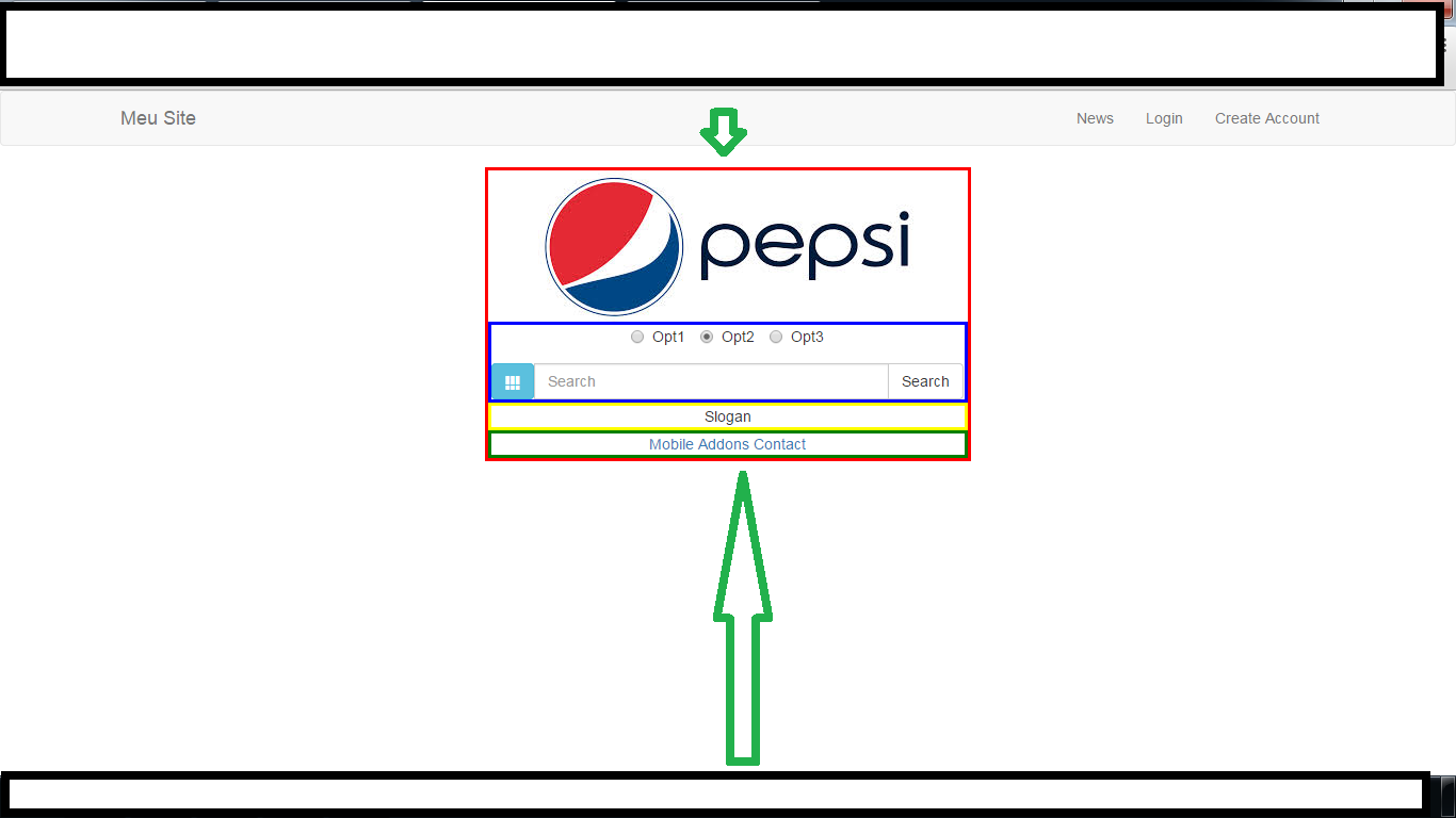
I'm having problems centralizing the page because centralizing both sides has already been done, I already added several classes and attributes in the style tag but I did not succeed, and to better exemplify what happened, I removed a print and put arrows but show the difference between the upper and lower side Head Code:

<head>
    <link rel="stylesheet" type="text/css" href="../FullPage/jquery.fullPage.css">
    <script type="text/javascript" src="../Bootstrap/js/jquery-1.11.1.js"></script>
    <script src="../FullPage/vendors/jquery.easings.min.js"></script>
    <script type="text/javascript" src="../FullPage/jquery.fullPage.js"></script>
    <script type="text/javascript" src="../Bootstrap/js/bootstrap.js"></script>
    <link rel="stylesheet" type="text/css" href="../Bootstrap/css/bootstrap.css" media="screen" />
    <meta name="viewport" content="width=device-width, initial-scale=1, maximum-scale=1" />
</head>

Bootstrap code

<body>
    <nav class="navbar navbar-default" role="navigation">
        <div class="container">
            <!-- Brand and toggle get grouped for better mobile display -->
            <div class="navbar-header">
                <button class="navbar-toggle" type="button" data-toggle="collapse" data-target="#bs-example-navbar-collapse-1"> 
                    <span class="sr-only">Toggle navigation</span> 
                    <span class="icon-bar"></span>
                    <span class="icon-bar"></span>
                    <span class="icon-bar"></span>
                </button> 
                <a class="navbar-brand" href="#">Meu Site</a>
            </div>
            <!-- Collect the nav links, forms, and other content for toggling -->
            <div class="collapse navbar-collapse" id="bs-example-navbar-collapse-1">
                <ul class="nav navbar-nav navbar-right">
                    <li><a href="#">News</a></li>
                    <li><a href="#">Login</a></li>
                    <li><a href="#">Create Account</a></li>
                </ul>
            </div><!-- /.navbar-collapse -->
        </div><!-- /.container -->
    </nav>

    <div class="container span7 text-center col-md-4 col-md-offset-3" style="margin: 0 auto;float: none; border: 3px solid red">
        <div class="row">
            <div>
                <img src="../../app.images/logo.jpg" />
            </div>
            <form style="border:3px solid blue" role="search">
                <div class="form-group">
                    <label class="radio-inline"><input type="radio" name="optradio">Opt1</label>
                    <label class="radio-inline"><input type="radio" name="optradio" checked="">Opt2</label>
                    <label class="radio-inline"><input type="radio" name="optradio">Opt3</label>
                </div>

                <div class="input-group">
                    <a href="#" class="btn btn-info input-group-btn" style="font-size:14px">
                        <span class="glyphicon glyphicon-th"></span>
                    </a>
                    <input class="form-control " type="text" placeholder="Search" />
                    <div class="input-group-btn">
                        <button class="btn btn-default" type="submit">Search</button>
                    </div>
                </div>
            </form>
            <div style="border:3px solid yellow">
                Slogan
            </div>
            <div style="border:3px solid green">
                <a href="#">Mobile</a>
                <a href="#">Addons</a>
                <a href="#">Contact</a>
            </div>
        </div>
    </div>
</body>

Interface Image (Pepsi Logo is illustrative only)

    
asked by anonymous 24.12.2014 / 17:31

4 answers

6

Viewing the "Box" with the Firefox Element Inspector, I noticed that the <div class="container span7 text-center col-md-4 col-md-offset-3" ...> (width = 419px) element is less than the width of the element <div class="row"> (width = 449px), this has hindered manipulating the elements using margin-top , top , position , etc.

So the best way was to create separate elements, there are two more practical ways to do this.

Using CSS flex


Please note that the flex property is not yet supported by some browsers (some browsers mobile for example)

The first way is to use the "flex" property and setting the height to 100% , note that to align the elements we use align-items: center;

div.flex-align {
  display: -webkit-flexbox;
  display: -ms-flexbox;
  display: -webkit-flex;
  display: flex;
  -webkit-flex-align: center;
  -ms-flex-align: center;
  -webkit-align-items: center;
  align-items: center;
  height: 100%;
}

The html should look like this:

<div class="flex-align"><!-- começa o flex -->
    <div class="container span7 text-center col-md-4 col-md-offset-3" style="margin: 0 auto;float: none; border: 3px solid red">
        <div class="row">
         ...
        </div>
    </div>
</div><!-- termina o flex -->

Using position and top

The second way, which is supported by older browsers, would be to use the height of the container element I captured with the Inspector and this was shown to be 116px (removing the edges should decrease):

Calculating this the code should look something like:

    <div style="position: absolute; height: 116px; top: 50%; width: 100%; left: 0;">
        <div style="position: relative; height: 116px; top: -58px;">
            Coloque o container aqui para teste
        </div>
    </div>

Explaining the code:

  • In the first DIV, I used position: absolute; to facilitate vertical alignment
  • I fixed the height according to the height of the container and applied top: 50% to align in the center of the screen
  • I used left: 0 , because left: auto (element pattern) ends up positioning the element according to the source
  • In the second DIV, I fixed the height and used position: relative; to be able to use the top
  • To align the second DIV I took the default height of the container element and divided by "2" (116/2 = 58) and set it negatively top: -58px;
  

Note: Just one tip, avoid "inline" styles, then you can move the whole CSS to your style sheet, or if it does not, create a main.css call (never change style sheets from libraries, such as bootstrap.css for example).

The code should look something like:

    <div style="position: absolute; width: 100%; height: 116px; top: 50%; left: 0;">
        <div style="position: relative; height: 116px; top: -58px; height: 116px;">

            <div class="container span7 text-center col-md-4 col-md-offset-3" style="margin: 0 auto; float: none; border: 3px solid red">
                <div class="row">
                    <div>
                        <img src="../../app.images/logo.jpg" />
                    </div>
                    <form style="border:3px solid blue" role="search">
                        <div class="form-group">
                            <label class="radio-inline"><input type="radio" name="optradio">Opt1</label>
                            <label class="radio-inline"><input type="radio" name="optradio" checked="">Opt2</label>
                            <label class="radio-inline"><input type="radio" name="optradio">Opt3</label>
                        </div>

                        <div class="input-group">
                            <a href="#" class="btn btn-info input-group-btn" style="font-size:14px">
                                <span class="glyphicon glyphicon-th"></span>
                            </a>
                            <input class="form-control " type="text" placeholder="Search" />
                            <div class="input-group-btn">
                                <button class="btn btn-default" type="submit">Search</button>
                            </div>
                        </div>
                    </form>
                    <div style="border:3px solid yellow">
                        Slogan
                    </div>
                    <div style="border:3px solid green">
                        <a href="#">Mobile</a>
                        <a href="#">Addons</a>
                        <a href="#">Contact</a>
                    </div>
                </div>
            </div>


        </div>
    
24.12.2014 / 20:14
0

Dude uses the class col-md-offset-4 off-set size can vary according to your grid if you want to center, remembering to obey the 12-column pattern.

    
24.12.2014 / 18:21
0

Bootstrap 3 Just call the centered class in the divs with the class "col-lg-", "col-md-", "col-sm-" or "col-xs-" (1-12).

    
24.12.2014 / 18:37
0

Well, as far as I know, the bootstrap does not have components to scale vertically.

Use the margin-top property in the style of the form.

example:

<form style="margin-top:100px">

    
24.12.2014 / 18:58