Delimit table within a modal with css

1

I have a modal that shows a table with some additional information from another table (I'll call it tableP ), the problem is that tableP has many items, which makes it relatively large, and the table that is in the modal is generated from it, making the Modal gigantic too, the problem is that the tableP when printed, gives me the option of scrolling, however the modal does not have that scrolling option leaving the table huge and cutting the same: So I would like to set a size for my Modal and if the table is large, have a scrolling option within the modal:

Follow CSS: modal_qm.css

    body {
  color: #333;
  font-family: 'Helvetica', arial;
}
.wrap {
  padding: 40px;
  text-align: center;
  float: left;
}

.btn {
  background: #808080;
  border: #808280 solid 1px;
  border-radius: 3px;
  color: #fff;
  display: inline-block;
  font-size: 14px;
  padding: 8px 15px;
  text-decoration: none;
  text-align: center;
  min-width: 60px;
  position: relative;
  transition: color .1s ease;
}
.btn:hover {
  background: #808280;
}
.btn.btn-big {
  font-size: 18px;
  padding: 15px 20px;
  min-width: 100px;
}
.btn-close {
  color: #aaa;
  font-size: 30px;
  text-decoration: none;
  position: absolute;
  right: 5px;
  top: 0;
}
.btn-close:hover {
  color: #919191;
}
.modal:before {
  content: "";
  display: none;
  background: rgba(0, 0, 0, 0.6);
  position: fixed;
  top: 0;
  left: 0;
  right: 0;
  bottom: 0;
  z-index: 10;
}
.modal:target:before {
  display: block;
}
.modal:target .modal-dialog {
  -webkit-transform: translate(0, 0);
  -ms-transform: translate(0, 0);
  transform: translate(0, 0);
  top: 20%;
}
.modal-dialog {
  background: #fefefe;
  border: #333 solid 1px;
  border-radius: 5px;
  margin-left: -400px;
  position: fixed;
  left: 50%;
  top: -100%;
  z-index: 11;
  width: 800px;
  -webkit-transform: translate(0, -500%);
  -ms-transform: translate(0, -500%);
  transform: translate(0, -500%);
  -webkit-transition: -webkit-transform 0.3s ease-out;
  -moz-transition: -moz-transform 0.3s ease-out;
  -o-transition: -o-transform 0.3s ease-out;
  transition: transform 0.3s ease-out;
}
.modal-body {
  padding: 20px;
  max-height: 50px;
  overflow: auto;
}
.modal-header,
.modal-footer {
  padding: 10px 20px;
}
.modal-header {
  border-bottom: #eee solid 1px;
}
.modal-header h2 {
  font-size: 20px;
}
.modal-footer {
  border-top: #eee solid 1px;
  text-align: right;
}

Here is the HTML / PHP excerpt that generates Modal with the table:

<link rel="stylesheet" type="text/css" href="modal_qm.css"/>

    <div class="wrap">
  <a href="#modal-one" class="btn btn-big">Tabelas consultadas</a>
</div>

<div class="modal" id="modal-one" aria-hidden="true">
  <div class="modal-dialog">
    <div class="modal-header">
      <h2>Tabelas - QuotesMem</h2>
      <a href="#" class="btn-close" aria-hidden="true">x</a>
    </div>
    <div class="modal-body">
      <table>
        <tbody>
        <?php

         echo '<tr align="center">';
         echo '<th>' .Papel. '</th>';
    for($h = 1; $h < $k + 1; $h++){
      $nome = "Tabela Server";
      $hora_top = "$nome $h";
      echo '<th>' .$hora_top. '</th>';
    }

    echo '</tr>';

for($n = 0; $n < $j; $n++){
      echo '<tr>';
      $trans = $mat[$n][(($k*2)+3)];
      echo '<td class='.$trans.'>' .$mat[$n][0]. '</td>';
      for($o = 0; $o < $k ; $o++){
        echo '<td class='.$trans.'>'.$mat[$n][(($k*2)+2)].'</td>';
}
echo '</tr>';
}
        ?>
        </tbody>
      </table>
    </div>
    <div class="modal-footer">
      <a href="#" class="btn">Voltar</a>
    </div>
  </div>
</div>

Modalis"larger" than the screen and does not have the scroll bar

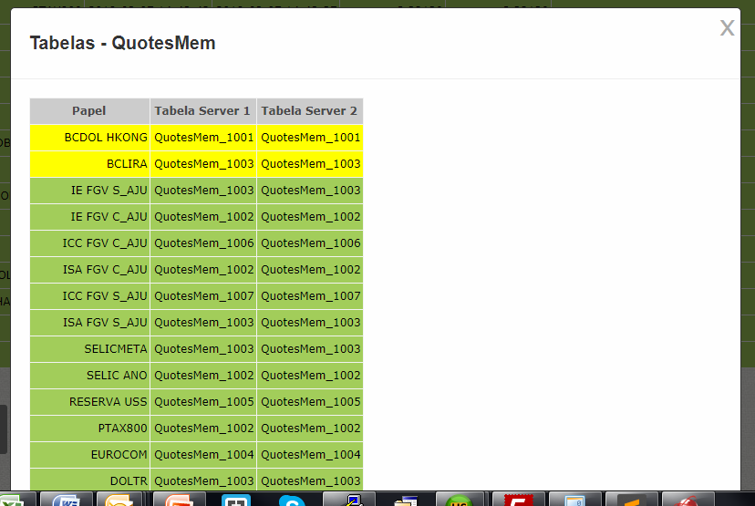
Modal is "bigger" than the screen and does not have the scroll bar

Edit1: I changed the question to show the table how it is now

    
asked by anonymous 07.03.2018 / 17:20

2 answers

1

I had to make a small change in the part where you call the table because the HTML was not well formatted.

In addition I needed to put some styles in .modal-body

That looks like this:

.modal-body {
  padding: 20px;
  max-height: 120px;
  overflow: auto;
}

See how the result was. Now you have a Scroll inside the Modal. ( OBS: to have scroll content must be greater than max-height, and overflow: auto only enables when content is greater than height) / p>

Show all page to see the best result

    body {
  color: #333;
  font-family: 'Helvetica', arial;
}
.wrap {
  padding: 40px;
  text-align: center;
  float: left;
}

.btn {
  background: #808080;
  border: #808280 solid 1px;
  border-radius: 3px;
  color: #fff;
  display: inline-block;
  font-size: 14px;
  padding: 8px 15px;
  text-decoration: none;
  text-align: center;
  min-width: 60px;
  position: relative;
  transition: color .1s ease;
}
.btn:hover {
  background: #808280;
}
.btn.btn-big {
  font-size: 18px;
  padding: 15px 20px;
  min-width: 100px;
}
.btn-close {
  color: #aaa;
  font-size: 30px;
  text-decoration: none;
  position: absolute;
  right: 5px;
  top: 0;
}
.btn-close:hover {
  color: #919191;
}
.modal:before {
  content: "";
  display: none;
  background: rgba(0, 0, 0, 0.6);
  position: fixed;
  top: 0;
  left: 0;
  right: 0;
  bottom: 0;
  z-index: 10;
}
.modal:target:before {
  display: block;
}
.modal:target .modal-dialog {
  -webkit-transform: translate(0, 0);
  -ms-transform: translate(0, 0);
  transform: translate(0, 0);
  top: 20%;
}
.modal-dialog {
  background: #fefefe;
  border: #333 solid 1px;
  border-radius: 5px;
  margin-left: -400px;
  position: fixed;
  left: 50%;
  top: -100%;
  z-index: 11;
  width: 800px;
  -webkit-transform: translate(0, -500%);
  -ms-transform: translate(0, -500%);
  transform: translate(0, -500%);
  -webkit-transition: -webkit-transform 0.3s ease-out;
  -moz-transition: -moz-transform 0.3s ease-out;
  -o-transition: -o-transform 0.3s ease-out;
  transition: transform 0.3s ease-out;
}
.modal-body {
  padding: 20px;
  max-height: 120px;
  overflow: auto;
}
.modal-header,
.modal-footer {
  padding: 10px 20px;
}
.modal-header {
  border-bottom: #eee solid 1px;
}
.modal-header h2 {
  font-size: 20px;
}
.modal-footer {
  border-top: #eee solid 1px;
  text-align: right;
}
<div class="wrap">
          <a href="#modal-one" class="btn btn-big">Tabelas consultadas</a>
        </div>
        
        <div class="modal" id="modal-one" aria-hidden="true">
          <div class="modal-dialog">
            <div class="modal-header">
              <h2>Tabelas - QuotesMem</h2>
              <a href="#" class="btn-close" aria-hidden="true">x</a>
            </div>
            <div class="modal-body">

                
              <table>
                  <tbody>
                    <tr>
                        <tr>
Lorem ipsum dolor sit amet consectetur adipisicing elit. Voluptates veniam explicabo labore nam vel praesentium, ipsa architecto reiciendis doloribus, voluptas numquam amet recusandae. Sequi, voluptas eius magni quidem cumque aut sunt ad aliquid! Nobis odio doloremque dolorem inventore cumque, officia, soluta recusandae ab quisquam, vero dolores quasi tempore error amet distinctio ipsam beatae cupiditate. Voluptatem tempore velit repudiandae quae, ullam doloremque sed nulla vitae tenetur ipsam fugit suscipit possimus sunt ad delectus et earum. Ea debitis similique consectetur error itaque nostrum quia earum quasi, beatae veniam quas porro, enim sed unde aliquid quo, dolorum excepturi? A non perspiciatis harum tempora.
<br><br>
Lorem ipsum dolor sit amet consectetur adipisicing elit. Voluptates veniam explicabo labore nam vel praesentium, ipsa architecto reiciendis doloribus, voluptas numquam amet recusandae. Sequi, voluptas eius magni quidem cumque aut sunt ad aliquid! Nobis odio doloremque dolorem inventore cumque, officia, soluta recusandae ab quisquam, vero dolores quasi tempore error amet distinctio ipsam beatae cupiditate. Voluptatem tempore velit repudiandae quae, ullam doloremque sed nulla vitae tenetur ipsam fugit suscipit possimus sunt ad delectus et earum. Ea debitis similique consectetur error itaque nostrum quia earum quasi, beatae veniam quas porro, enim sed unde aliquid quo, dolorum excepturi? A non perspiciatis harum tempora.

                        </td>
                    </tr>
                </tbody>
              </table>
           
            </div>
            <div class="modal-footer">
              <a href="#" class="btn">Voltar</a>
            </div>
          </div>
        </div>
    
07.03.2018 / 18:44
1

Create a new class (or use class 'modal-body'), set height and add overflow: auto property, this should solve your problem.

However, you need to pay attention to the structure of your code.

  • The <center> tag is not supported in HTML5, see the version of your html .
  • You do not need to enter the <html> and <body> tags within the modal. These tags have already been defined on your page.
  • If you want to further define the structure of your <table> , use <thead> and <tbody> .
07.03.2018 / 17:57