Two distinct elements can hurt HTML semantics as they will insert content redundancy into the document. One of the <h1> elements would be merely aesthetic and add nothing to the content, so it should not be in the content. To avoid this, you can use the element :after :
h1 {
  position: relative;
}

h1:after {
  content: attr(title);
  position: absolute;
  bottom: 0;
  left: 0;
  transform: scaleY(-1);
  transform-origin: bottom;
  background: linear-gradient(to bottom, rgba(0, 0, 0, 0) 30%, rgba(0, 0, 0, 0.5) 80%);
  -webkit-background-clip: text;
  -webkit-text-fill-color: transparent;
}
<h1 title="Reflection">Reflection</h1>
So, with CSS in element :after there is no way to fetch the content of the parent element (not yet, at least), but you can search for an attribute of this element, such as the title attribute. It is important to note that even though it is the same content as the element, this will not be redundant, because semantically the text of title will be treated differently from the content and there will be no problems in being equal.
The attribute title , inclusive, is a global attribute, which means that all HTML elements support.
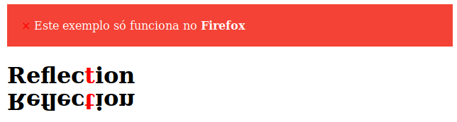
A similar effect would be possible using the element function of the CSS, however it has almost no support at present. With this function, you can set another element of the document as the background, so you could generate the shadow even with all the color effects in your font:
h1 {
  position: relative;
}

h1:after {
  content: '';
  width: 100%;
  height: 100%;
  transform: scaleY(-1);
  transform-origin: bottom;
  background: -moz-element(#foo) ;
  position: absolute;
  bottom: 0;
  left: 0;
}

span {
  color: red;
}


.alert {
    padding: 20px;
    background-color: #f44336; /* Red */
    color: white;
    margin-bottom: 15px;
}
<div class="alert">
<span class="closebtn" onclick="this.parentElement.style.display='none';">×</span>
Este exemplo só funciona no <strong>Firefox</strong>
</div>
<h1 id="foo">Reflec<span>t</span>ion</h1>
The result, for those who do not have Firefox (or is too lazy to test) is: