GRID column size Bootstrap - Custom value

1

Greetings!

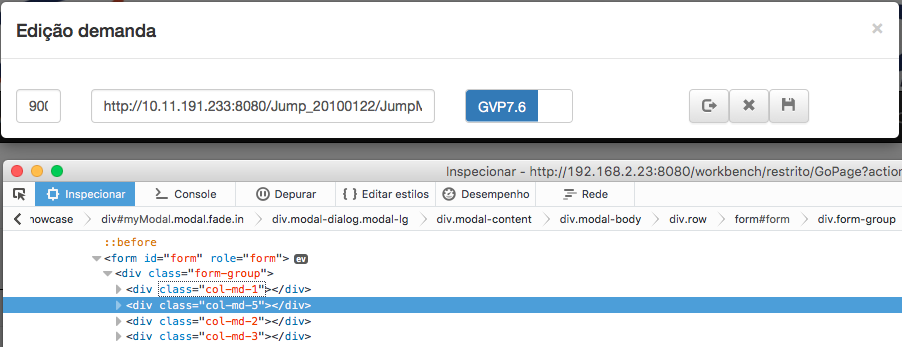
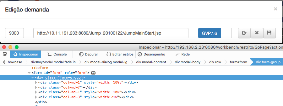
Could someone give me a light on the image below ... Question X is that I need a middle ground in this alignment. If I put col-md-1 it cuts the input if I put col-md-2 gets too big.

I tried to use span but it worsened the situation with bootsptrap-switch :( getting misaligned horizontally.

[] 's

    
asked by anonymous 04.08.2016 / 18:44

2 answers

3

Thanks to all but I ended up solving it by adding a little style ... as it is a specific point this solution was easier and easier ..

    
04.08.2016 / 20:29
0

Bootstrap column width values are defined in percentage terms as well as responsive. If col-md-1 got too small, probably its view is small. To improve the width usage, use the container-fluid class in the div that envelops the entire site to take up as much area as possible.

However, it is preferable that you use a size of 12 columns for the label and 12 for the input field. It's easier to see on small desktops.

    
04.08.2016 / 19:36