


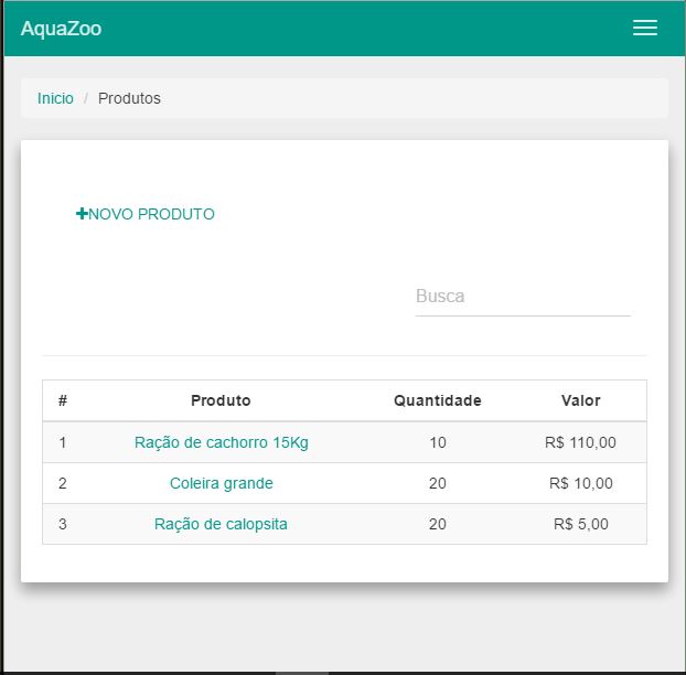
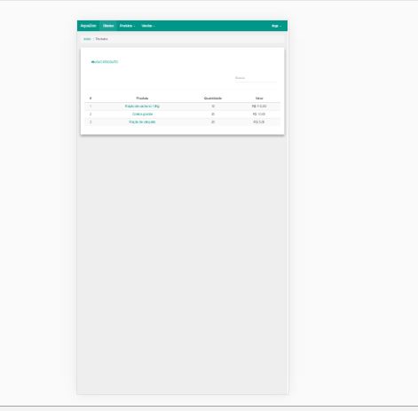
I'm using bootstrap-material on a system, if I use the non-maximized browser the responsiveness works. But not on mobile devices. Does anyone know what it can be?
Styles
<linkhref="{{ elixir('css/all.css') }}" rel="stylesheet"/>
<link href="/resources/bootstrap-material-design/dist/css/bootstrap-material-design.min.css" rel="stylesheet">
<link href="/resources/bootstrap-material-design/dist/css/ripples.min.css" rel="stylesheet">
<link href="/resources/bootstrap-material-design/dist/sassc/ripples.css" rel="stylesheet">
<link href="/resources/bootstrap-material-design/dist/sassc/bootstrap-material-design.css" rel="stylesheet">
Scripts
<script src="/resources/js/jquery.js"></script>
<script src="/resources/js/bootstrap.js"></script>
<script src="{{ elixir('js/all.js') }}"></script>
<script src="/resources/bootstrap-material-design/dist/js/material.js" type="text/javascript"></script>
<script src="/resources/bootstrap-material-design/dist/js/ripples.js" type="text/javascript"></script>
Is there any other css that I need to import?