You need to set the grid-auto-flow property to row dense , so every element of the Grid will try to fit in the "empty" spaces
Here you can read and see some practical examples of grid-auto-flow link
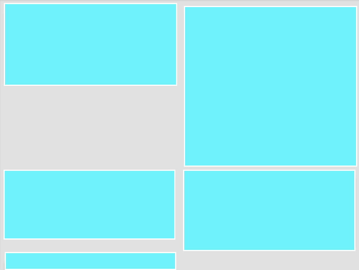
Here's an example. Notice that the n4 should be after n3 , but it goes up to the empty space that n3 left, since n3 starts in the second column, not the first.
Example with property grid-auto-flow: row dense; applied:
html, body {
width: 100%;
height: 100%;
margin: 0;
padding: 0;
}
.item3 { grid-column: 2 / 3; }
.grid-container {
display: grid;
 grid-template-columns: repeat(auto-fill, 50% );
 grid-auto-rows: minmax(120px, auto);
grid-auto-flow: row dense;
grid-gap: 10px;
background-color: #2196F3;
padding: 10px;
}
.grid-container>div {
background-color: rgba(255, 255, 255, 0.8);
text-align: center;
padding:20px 0;
font-size: 30px;
}
    <p>O valor "dense" no grid-auto-flow faz o efeito que vc precisa </p>
    <div class="grid-container">
      <div class="item1">1</div>
      <div class="item2">2</div>
      <div class="item3">3</div>
      <div class="item4">4</div>
    </div>
Example SEM applied property:
html, body {
  width: 100%;
  height: 100%;
  margin: 0;
  padding: 0;
}
.item3 { grid-column: 2 / 3; }

.grid-container {
  display: grid;
  grid-template-columns: repeat(auto-fill, 50% );
 grid-auto-rows: minmax(120px, auto);
  /* grid-auto-flow: row dense; */
  grid-gap: 10px;
  background-color: #2196F3;
  padding: 10px;
}
.grid-container>div {
  background-color: rgba(255, 255, 255, 0.8);
  text-align: center;
  padding:20px 0;
  font-size: 30px;
}
    <p>SEM no grid-auto-flow</p>
    <div class="grid-container">
      <div class="item1">1</div>
      <div class="item2">2</div>
      <div class="item3">3</div>
      <div class="item4">4</div>
    </div>
More complex example with dense by Wes Bos
    .container {
      display: grid;
      grid-gap: 20px;
      grid-template-columns: repeat(10, 1fr);
      grid-auto-flow: dense;
    }
    .item:nth-child(6n) {
      background: cornflowerblue;
      grid-column: span 6;
    }
    .item:nth-child(8n) {
      background: tomato;
      grid-column: span 2;
    }
    .item:nth-child(9n) {
      grid-row: span 2;
    }
    .item18 {
      background: greenyellow !important;
      grid-column-end: -1 !important;
    }
    .item {
      background: silver;
    }
  <div class="container">
    <div class="item item1">1</div>
    <div class="item item2">2</div>
    <div class="item item3">3</div>
    <div class="item item4">4</div>
    <div class="item item5">5</div>
    <div class="item item6">6</div>
    <div class="item item7">7</div>
    <div class="item item8">8</div>
    <div class="item item9">9</div>
    <div class="item item10">10</div>
    <div class="item item11">11</div>
    <div class="item item12">12</div>
    <div class="item item13">13</div>
    <div class="item item14">14</div>
    <div class="item item15">15</div>
    <div class="item item16">16</div>
    <div class="item item17">17</div>
    <div class="item item18">18</div>
    <div class="item item19">19</div>
    <div class="item item20">20</div>
    <div class="item item21">21</div>
    <div class="item item22">22</div>
    <div class="item item23">23</div>
    <div class="item item24">24</div>
    <div class="item item25">25</div>
    <div class="item item26">26</div>
    <div class="item item27">27</div>
    <div class="item item28">28</div>
    <div class="item item29">29</div>
    <div class="item item30">30</div>
  </div>
More complex example, but without dense it uses grid-auto-flow:row;
.container {
  --gridgap:16px;
  --boxheight:100px;
  display:grid;
  grid-gap:var(--gridgap);
  grid-template-columns: repeat(auto-fill, minmax(150px, 1fr));
  grid-auto-rows: minmax(100px, auto);
  grid-auto-flow:row;
  max-width:600px;
}

.box {
  outline:1px solid black;
  padding:8px;
  height:var(--boxheight);
}

.box.tall2  {
  height:calc(var(--boxheight)*2 + 2*var(--gridgap));
  grid-row-end:span 2
}

.box.tall3  {
  height:calc(var(--boxheight)* + 4*var(--gridgap));
  grid-row-end:span 3
}

.box.tall4  {
  height:calc(var(--boxheight)*4 + 6*var(--gridgap));
  grid-row-end:span 4
}
<section class='container'>
  <section class='box'>Box 1</section>
  <section class='box'>Box 2</section>
  <section class='box tall2'>Box 3</section>
  <section class='box tall3'>Box 4</section>
  <section class='box tall4'>Box 5</section>
  <section class='box'>Box 6</section>
  <section class='box'>Box 7</section>
  <section class='box'>Box 8</section>
  <section class='box'>Box 9</section>
  <section class='box'>Box 10</section>
  <section class='box'>Box 11</section>
  <section class='box'>Box 12</section>
</section>
Source: link