Element Rotation With Arrow

7

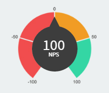
Asyoucanseeinthispicture,insidethedarkgrayballhasanumber.It's100.Thatmeansthepointerhastohit100there.

Ifitis0,thepointermustbeinthemiddle.

ThepointisthatthisNPS(NetPromoterScore)valueis-100to100.

Icannotmakethecountthatmakesthispointerrotateaccordingtothenumberinsidethatcanrangefrom-100to-100.

Sofar:

CSS

.meter{position:relative;.round{content:"";
        position: absolute;
        top: 0;
        left: 0;
        right: -3px;
        bottom: -14px;
        margin: auto;
        width: 91px;
        height: 91px;
        border-radius: 50%;
        background-color: #3d3d3d;
        z-index: 1;
        &:after{
            content: "";
            position: absolute;
            top: -19px;
            left: 35px;
            z-index: 2;
            width: 0;
            height: 0;
            border-style: solid;
            border-width: 0 10px 20px 10px;
            border-color: transparent transparent #3d3d3d transparent;
        }
    }
    > img{
        vertical-align: middle;
        width: 170px;
        margin: auto;
    }

    .result{
        position: absolute;
        top: 0;
        font-size: 30px;
        color: #FFF;
        bottom: 0;
        left: 0;
        right: 0;
        width: 100%;
        z-index: 2;
        margin: auto;
        height: 45px;
        text-align: center;
        small{
            font-size: 12px;
            margin-top: -10px;
            display: block;
        }
    }
}

HTML

<div class="meter">
   <div class="round"></div>
   <img src="images/dash/meter.png">
   <span class="result">100<small>NPS</small></span>
</div>

I put it in JS Fiddle for better resolution:

link

    
asked by anonymous 28.07.2016 / 21:47

1 answer

9

You can use transform-origin , in the pseudo element :after , set it in the center of the parent element. See

-ms-transform-origin: 11px 58px; 
-moz-transform-origin: 11px 58px; 
-webkit-transform-origin: 11px 58px; 
transform-origin: 11px 58px; /* Centraliza o ponto base para rotação */

So just put the desired rotation, put as an example in a hover:

.meter:hover .round:after{
  -ms-transform: rotate(-45deg); 
  -webkit-transform: rotate(-45deg); 
  transform: rotate(-45deg);
}

Running: link

As for the calculation, just know that -100 in the pointer, worth the -140 degrees , so any other value is a simple rule of three. For example, if you want to find -50 .

  -140 --- -100
    x  --- -50

   x = -70

Then for the arrow to stop at -50 just put -70deg in the css rotation.

    
28.07.2016 / 22:16