


I'm having trouble trying to leave some% s of self-tuning% s vertically.
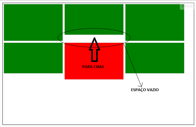
Thereisspacerequiredforthedivtobeexactlybelowtheoneaboveit,butitdoesnotrise,thereisanemptyspacebetweenthetwo.(i.e.
Example in JSFiddle
I'm having trouble trying to leave some% s of self-tuning% s vertically.
Thereisspacerequiredforthedivtobeexactlybelowtheoneaboveit,butitdoesnotrise,thereisanemptyspacebetweenthetwo.(i.e.
Example in JSFiddle
There is a Javascript under the name Isotope that can be used for this:
The configuration is very simple, following its own model:
<script type="text/javascript">
    $(document).ready(function(e) {
        $('.container').isotope();
    });
</script>
Full Html Code
<!DOCTYPE HTML>
<html>
<head>
<meta charset="utf-8">
<title>Untitled Document</title>
        <script type="text/javascript" src="http://ajax.googleapis.com/ajax/libs/jquery/1.5.1/jquery.min.js"></script><scripttype="text/javascript" src="http://isotope.metafizzy.co/isotope.pkgd.js"></script><scripttype="text/javascript">
            $(document).ready(function(e) {
                $('.container').isotope();
            });
        </script>
        <style>
            *, html {
                margin:0;
                padding:0;
            }
           .container {
                width: 650px;
                height: 400px;
                margin-left: auto;
                margin-right: auto;
                border: 1px solid black;
            }

            .box {
                width: 192px;
                margin: 2.5px;
                border: 1px solid #c8c8c8;
                float: left;
                background-color: green;
            }

            .box-1, .box-3, .box-5 {
                height: 120px;
            }

            .box-2, .box-4, .box-6 {
                height: 100px;
            }

            .box-5 {
                background-color: red !important;
            }
        </style>
    </head>
    <body>
        <div class="container">
            <div class="box box-1"></div>
            <div class="box box-2"></div>
            <div class="box box-3"></div>
            <div class="box box-4"></div>
            <div class="box box-5"></div>
            <div class="box box-6"></div>
        </div>
    </body>
</body>
Example Demo p>
Has many settings documented on the site itself >.
In addition to that, you have Masonry that can be called in the same way as in the first example:
<script type="text/javascript" src="http://ajax.googleapis.com/ajax/libs/jquery/1.5.1/jquery.min.js"></script><scripttype="text/javascript" src="http://masonry.desandro.com/masonry.pkgd.min.js"></script><scripttype="text/javascript" language="javascript">
    $(document).ready(function(e) {
          $('.container').masonry();
    });
</script>
Example: Demo p>
Masonry has GitHub and its documentation .
Generally I see this structure in portals and in this case it seems that working the structure emphasizing the columns of a grid is the best way, because in each column we would have the blocks arranged one after the other without appearing the "holes" in the layout.
I made a quick sketch of the solution, note:
By the way, the columns did not behave very well with the "display: inline-block", so I used the "float: left" that fits better.
I use the Masonry
Installing by Bower
bower install masonry --save
Or CDN
<script src="https://unpkg.com/masonry-layout@4/dist/masonry.pkgd.js"></script>Using:Jquery
$('.grid').masonry({//options...itemSelector:'.grid-item',columnWidth:200});UsingAttributesinHTML
<divclass="grid" data-masonry='{ "itemSelector": ".grid-item", "columnWidth": 200 }'>
  <div class="grid-item"></div>
  <div class="grid-item"></div>
  ...
</div>
An example of how the result is: link