Collapse bootstrap 4 does not work mobile [closed]

1

I'm having a collapse problem with bootstrap 4 in mobile mode.

It opens normally but does not close, I've spent a lot of time trying to solve it and even more searching! Please help me ...

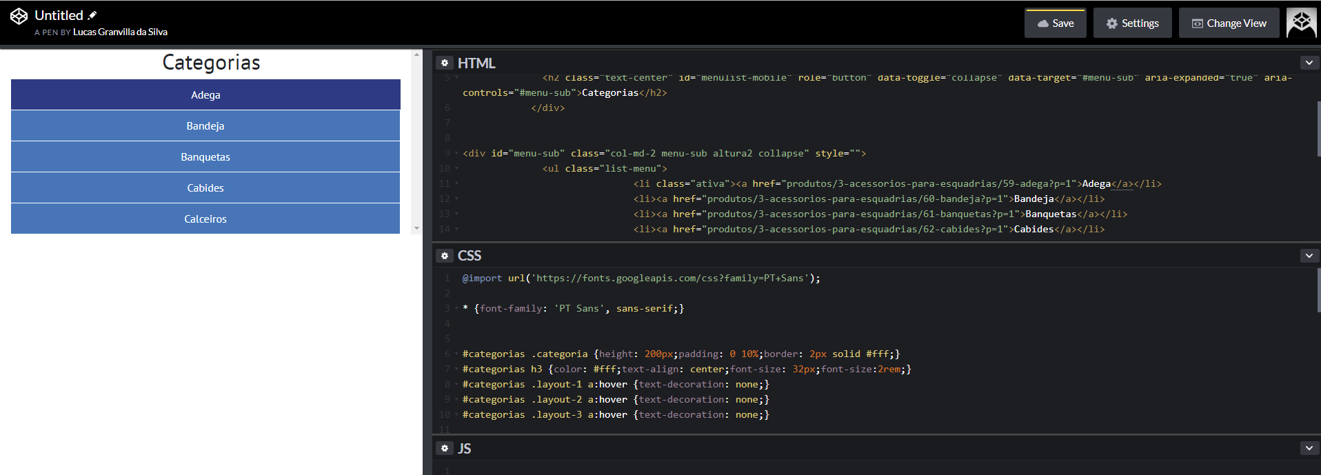
Please check the correct resolution as the image.

Link: link

    
asked by anonymous 30.11.2018 / 18:26

2 answers

2

Your problem is simple, your btn of "menu" is with position: absolute, so it is "hidden" by the contents of it opens when you click.

Just add a z-index to this btn of the menu that you solve the problem

See:

@import url('https://fonts.googleapis.com/css?family=PT+Sans');

* {
  font-family: 'PT Sans', sans-serif;
}


#categorias .categoria {
  height: 200px;
  padding: 0 10%;
  border: 2px solid #fff;
}

#categorias h3 {
  color: #fff;
  text-align: center;
  font-size: 32px;
  font-size: 2rem;
}

#categorias .layout-1 a:hover {
  text-decoration: none;
}

#categorias .layout-2 a:hover {
  text-decoration: none;
}

#categorias .layout-3 a:hover {
  text-decoration: none;
}

.menu-sub {
  overflow-y: scroll;
  max-width: 0px;
  transition: all 1s ease-in-out;
}

.menu-sub ul {
  padding: 0;
  margin-bottom: 0;
}

.menu-sub ul li {
  list-style: none;
  padding: 10px 0;
  margin: 1px;
  background: #4775b8;
  text-align: center;
  position: relative;
  transition: all 0.2s linear;
}

.menu-sub ul li:hover {
  background: #2e3b84;
}

.menu-sub ul li.ativa {
  background: #2e3b84;
  border: 25px solid #fff;
  padding: 0;
  border-bottom-color: transparent;
  border-top-color: transparent;
  border-left-color: transparent;
  border-bottom-color: transparent;
  margin-right: 0;
  height: 0;
}

.menu-sub ul li.ativa a {
  position: relative;
  top: -13px;
}

.menu-sub ul li a {
  color: #fff;
}

.menu-sub ul li a:hover {
  color: #fff;
  text-decoration: none;
}

.cart-mobile {
  display: none;
}

@media screen and (min-height: 0px) and (max-width: 767px) {

  .list-produtos {
    margin-top: 30px;
    max-width: 100%;
  }

  .list-menu {
    margin-top: 45px;
  }

  .menu-desktop {
    display: none;
  }

  .menu-sub {
    max-width: none;
  }

  .menu-sub ul li.ativa {
    border: none;
    padding: 10px 0;
    height: auto;
  }

  .menu-sub ul li.ativa a {
    position: static;
  }

  .max-100 {
    max-width: 100% !important;
  }
}
.menubar-mobile {
  z-index: 10;
}
<link rel="stylesheet" type="text/css" media="screen" href="https://maxcdn.bootstrapcdn.com/bootstrap/4.0.0/css/bootstrap.min.css" />
	<link rel="stylesheet" type="text/css" media="screen" href="https://maxcdn.bootstrapcdn.com/font-awesome/4.7.0/css/font-awesome.min.css" />

	<script src="https://code.jquery.com/jquery-3.2.1.min.js"></script><scriptsrc="https://cdnjs.cloudflare.com/ajax/libs/popper.js/1.12.9/umd/popper.min.js"></script>
	<script src="https://maxcdn.bootstrapcdn.com/bootstrap/4.0.0/js/bootstrap.min.js"></script><scriptsrc="https://maxcdn.bootstrapcdn.com/bootstrap/4.0.0-beta.3/js/bootstrap.bundle.min.js"></script>


	<div class="col-12 menubar-mobile position-absolute" id="menulist-mobile">
		<h2 class="text-center" id="menulist-mobile" role="button" data-toggle="collapse" data-target="#menu-sub"
		 aria-expanded="true" aria-controls="#menu-sub">Categorias</h2>
	</div>


	<div id="menu-sub" class="col-md-2 menu-sub altura2 collapse" style="">
		<ul class="list-menu">
			<li class="ativa"><a href="produtos/3-acessorios-para-esquadrias/59-adega?p=1">Adega</a></li>
			<li><a href="produtos/3-acessorios-para-esquadrias/60-bandeja?p=1">Bandeja</a></li>
			<li><a href="produtos/3-acessorios-para-esquadrias/61-banquetas?p=1">Banquetas</a></li>
			<li><a href="produtos/3-acessorios-para-esquadrias/62-cabides?p=1">Cabides</a></li>
			<li><a href="produtos/3-acessorios-para-esquadrias/63-calceiros?p=1">Calceiros</a></li>
		</ul>
	</div>
    
30.11.2018 / 18:45
2

Without getting into the merit of the code, the problem is that in mobile mode the menu div is getting over the text that controls it.

Add z-index: 1 to div#menulist-mobile within @media:

#menulist-mobile{
   z-index: 1;
}

This will make the div that contains <h2> override the menu div.

    
30.11.2018 / 18:47