How to make a DIV fill all the available width

7

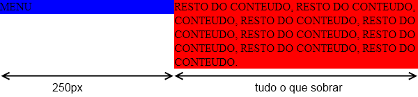
I have two divs, one with fixed width, 250px; which is on the left, will be a set menu, always left. And another div on the right that I want to make it 100%, whenever the user manipulates the corners of the screen, it was 100%.

Something like this:

.menu{width: 250px; float: left; position;fixed}
.resto{width:100%; float:right;}
    
asked by anonymous 24.02.2014 / 13:32

8 answers

7

Do this:

.menu{ width: 250px; float: left; background-color: blue; }
.resto{ background-color: red; overflow: hidden;}

So that it looks like this:

Notethatifthecontenthasmultiplelines,itwillnotappearunderthemenu.Thisisdonebyusingtheoverflow:hiddenstyle.Also,thecontentdoesnotneedthefloatstyleyouused.

Example in jsfiddle

If it were not for the use of overflow: hidden it would look like this:

    
24.02.2014 / 14:02
3

I think that's right: EXAMPLE

CSS:

//Opcional para pegar 100% de altura
body, html, .menu, .resto{
    height: 100%;
    color: #fff;
}

.menu{
    width: 250px; 
    float: left; 
    background-color: #f09; 
    position:blocked;
}

HTML:

<div class="menu">
    Menu Fixed com 250px
</div>
<div class="resto">
    Resto do conteudo (liquido)
</div>
    
24.02.2014 / 14:01
1

If you want the% change_with% to change the size depending on the handle of the screen, you must have all measurements in% with_%. That is, div's has to pass % . Otherwise it will always assume this size and never the screen size.

EDIT: I think this is what you are looking for. You have to use 250px to % . Here's the JSFiddle I made, I think it's your solution:

JSFIDDLE with div's

    
24.02.2014 / 13:34
0

Do you want to make a responsive layout? If so, take a look at bootstrap grid template , this way you will be able to responsibly layouts.

    
24.02.2014 / 13:36
0

I think what you want is a side menu and the content in the center? Take a look at the example I made: link

    
24.02.2014 / 14:05
0

Here is a possible solution to your problem.

PS: position: blocked, as quoted is not a value allowed for position.

HTML

<div class="box">
  <div class="col1">...</div>
  <div class="col2">...</div>
</div>

CSS

.box {
  border:1px solid #ccc;
  width: 900px;
  overflow:hidden;
}

/* coluna da esquerda */
.col1 {
  background-color: red;
  float: left;
  width: 300px;
}

/* coluna da direita */
.col2 {
  background-color: blue;
  width: 100%;
}

View in JSFiddle

    
26.02.2014 / 03:49
0

If you want to use the menu with position:fixed , a good way would be:

.menu{
    width:250px;
    position:fixed;
    top:0;left:0;
}
.resto{
    margin-left:250px;
}

Example: FIDDLE

    
26.02.2014 / 14:04
0

Thanks to all, I have managed to solve.

In the Menu div. I used it as usual:

.menu{position:fixed; width:192px; z-index:10;}
.resto{float:right; margin: 0 auto;}

So, it took a JS

function resizeHome(){
    var largura = $(window).width();
        if(largura>=*tamanho mínimo da tela (VALOR)*){
            $('.resto').css('width',($(window).width()-*largura da div menu*)+'px');
        }
}
    
26.02.2014 / 12:37