


I have a question, how can I insert images with different sizes inside a div, and if the image is very large vertically, it has height: 100% , and if is very large horizontally with width: 100% ?
An example image:
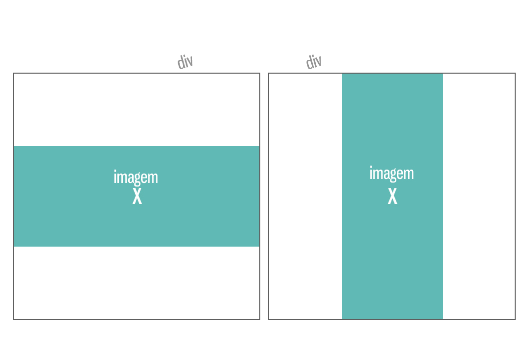
I have a question, how can I insert images with different sizes inside a div, and if the image is very large vertically, it has height: 100% , and if is very large horizontally with width: 100% ?
An example image:
Use a combination of background images and behavior settings via CSS.
Explanation:
background-size:contain will force the background image to be contained within the element; background-repeat:no-repeat will make the image appear only once; background-position: center will center the image on both axes, regardless of size or width.
.container {
  width:200px;
  height:200px;
  display:inline-block;
  background-size:contain;
  background-repeat:no-repeat;
  background-position: center;
  border:1px solid black;
  }
<div class='container' style='background-image:url(https://upload.wikimedia.org/wikipedia/commons/7/72/Wide_view_over_S%C3%B8rfjorden_from_the_coast_of_Sveingard,_2012_June.jpg)'>
</div>
<div class='container' style='background-image:url(http://wvs.topleftpixel.com/photos/scotia_plaza_tall_stitched.jpg)'>
</div> If you are trying to do this using the <img> tag, you can do this by not specifying a altura or largura for the image, but rather by setting the following values:
max-width:100%;
max-height:100%;
And to center the image in the center:
display: flex;
align-items: center;
justify-content: center;
There are other ways to center elements in the center, but in this case this was the way I used it.
All together will be something like in this example below CodeSnippet:
(You also have JSFIDDLE EXAMPLE if you prefer)
img {
    max-width: 100%;
    max-height: 100%;
}

.caixa {
    height: 180px;
    width: 180px;
    background-color: #C8ECFF;
    border:2px solid #717171;
    margin-bottom:15px;

    /* Centralizando imagens */
    display: flex;
    align-items: center;
    justify-content: center;
}
<div class="caixa">
<img src="http://i.stack.imgur.com/CMoaX.jpg"></div><divclass="caixa">
<img src="http://i.stack.imgur.com/lIkte.jpg">
</div>Set the width and maximum height:
<img src="suaimagem.jpg" style="max_width:123px; max-height=123px"></img>
In your css set the style as follows:
<style>
img{
    width:auto;
    height:auto;
}
</style>
To solve your problem you should take the size of the image by javascript and make a comparison between width and heigth. In our example, we'll use the
1st we get the size by jQuerey:
Largura = $('img#foto').width();
Altura = $('img#foto').height();
2 ° Make comparison to know which is greater:
if(largura > altura){
   $('foto').css("width","100%");
}else{
   $('foto').css("height","100%");
}
This will probably solve your problem.