I'm trying to create a responsive layout. Some elements it is applying the css as quoted in the media queries, some others is getting web css. How can I arrange for him to get the corresponding css of what I want? Why does this occur?
Here's an example:
.scss:
@media (min-device-width: 320px)
and (max-device-width: 564px){
.button-collapse{
    background-color: red;
    border: none;
    color: red;
    outline: none;
  }
}

.button-collapse{
  background-color: transparent;
  border: none;
  color: white;
  outline: none;
}
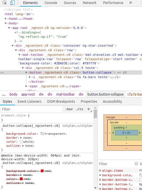
In this case, using a 320px width device it is taking the properties out of the media, why does this occur? Follow the image in more detail.