


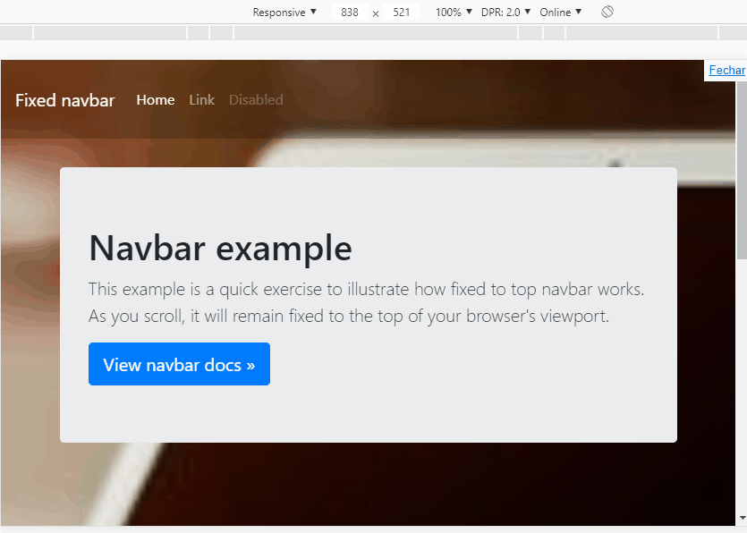
How to make the scrolling fixed menu scrolling like that of the site:
Note that when you scroll, the background of the menu changes to black.
How to make the scrolling fixed menu scrolling like that of the site:
Note that when you scroll, the background of the menu changes to black.
With a simple jQuery you do that. In this example when the person scrolls the 40px screen I'm going to put a .ativo class in Navbar with id menu . When it rolls back I retreat the class .ativo .
Seetheexampletounderstandbetter.IusedBootstrap4sinceyouputtheBootstraptag,butitworksonanycode,aslongasithasjQuerylikeBootstrap
TheonlyCSSincludedistostylenavtolooksimilartotheexample.
OBS:Ileftcommentsinthecodetomakeiteasiertounderstand
$(window).scroll(function() {
var scroll = $(window).scrollTop();
  if (scroll >= 40) {               // se rolar 40px ativa o evento
    $("#menu").addClass("ativo");    //coloca a classe "ativo" no id=menu
  } else {
    $("#menu").removeClass("ativo"); //se for menor que 40px retira a classe "ativo" do id=menu
  }
});
body {
min-height: 75rem;
padding-top: 7.5rem;
background-image: url(https://unsplash.it/400/200?image=6);
background-size: cover;
background-position: center;
margin: 0;
}
#menu {
background-color: rgba(0,0,0,0.2) !important;
padding: 1.5rem 1rem;
transition: all 500ms linear;
}
#menu.ativo {
background-color: rgba(0,0,0,0.8) !important;
padding: .5rem 1rem;
}<link rel="stylesheet" type="text/css" media="screen" href="https://maxcdn.bootstrapcdn.com/bootstrap/4.0.0/css/bootstrap.min.css" />
<script src="https://code.jquery.com/jquery-3.2.1.min.js"></script><scriptsrc="https://cdnjs.cloudflare.com/ajax/libs/popper.js/1.12.9/umd/popper.min.js"></script>
<script src="https://maxcdn.bootstrapcdn.com/bootstrap/4.0.0/js/bootstrap.min.js"></script><navid="menu" class="navbar navbar-expand-md navbar-dark fixed-top bg-dark">
<a class="navbar-brand" href="#">Fixed navbar</a>
<button class="navbar-toggler collapsed" type="button" data-toggle="collapse" data-target="#navbarCollapse"
aria-controls="navbarCollapse" aria-expanded="false" aria-label="Toggle navigation">
<span class="navbar-toggler-icon"></span>
</button>
<div class="navbar-collapse collapse" id="navbarCollapse">
<ul class="navbar-nav mr-auto">
<li class="nav-item active">
<a class="nav-link" href="#">Home <span class="sr-only">(current)</span></a>
</li>
<li class="nav-item">
<a class="nav-link" href="#">Link</a>
</li>
<li class="nav-item">
<a class="nav-link disabled" href="#">Disabled</a>
</li>
</ul>
</div>
</nav>
<main role="main" class="container">
<div class="jumbotron">
<h1>Navbar example</h1>
<p class="lead">This example is a quick exercise to illustrate how fixed to top navbar works. As you
scroll, it will remain fixed to the top of your browser's viewport.</p>
<a class="btn btn-lg btn-primary" href="../../components/navbar/" role="button">View navbar docs »</a>
</div>
</main>