If you remove width from any of the .container or .containerNome classes this unwanted effect of straining the div pai will disappear:
.containerNome{
height: 23px;
border: 1px rgb(0, 0, 0) solid;
background: rgb(0, 0, 255);
-webkit-border-top-left-radius: 10px;
-moz-border-radius-topleft: 10px;
border-top-left-radius: 10px;
-webkit-border-top-right-radius: 10px;
-moz-border-radius-topright: 10px;
border-top-right-radius: 10px;
-moz-box-shadow: inset 3px 3px 0px 0px rgba(0, 0, 0, 0.22);
-webkit-box-shadow: inset 3px 3px 0px 0px rgba(0, 0, 0, 0.22);
box-shadow: inset 3px 3px 0px 0px rgba(0, 0, 0, 0.22);
}
.container{
width: 97px;
height: 112px;
border: 1px rgb(0, 0, 0) solid;
background: rgb(255, 255, 153);
-webkit-border-radius: 10px;
-moz-border-radius: 10px;
border-radius: 10px;
}
<div class="container" style="float: left; margin-left: 5px; margin-bottom: 5px;">
<div class="containerNome"></div>
</div>
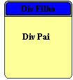
Here's why this happens. In this example we have 2 divs, div pai and div filho whose width is equal for both classes, which in this case is width:97px;
.containerNome{
    width: 97px;
}
.container{
    width: 97px;
}
So far so good, this strap-effect will not be visible as you can see here in this example . But when we add the border, that's where this unwanted effect appears.
.containerNome{
    width: 97px;
    border: 1px rgb(0, 0, 0) solid;
}
.container{
    width: 97px;
    border: 1px rgb(0, 0, 0) solid;
}
What happens - The div .container for being a div filho and being within div pai it will respect this and will begin to be rendered from where the border ends (left) and where it begins the main area of div pai (which is the yellow area). So when we give border: 1px rgb(0, 0, 0) solid; to div filho we're adding another 2 pixels wide to it, because by adding that border we're adding 2 pixels in border-left:1px; and border-right:1px; . This will give a total no 97px but 99px width of this div . To compensate for these 2 additional pixels, we would have to remove them from the width that would be - width:95px; . Example in jsFiddle
.containerNome{
    width: 95px; /* Foram removidos 2px para compensar o aumento dos 2px adicionais da borda abaixo */
    border: 1px rgb(0, 0, 0) solid; /* Isto adiciona uma borda de 1px do lado esquerdo, topo, direito, e em baixo */
}
The higher the border, the more we will have to reduce the value of width so that it has a total width of% width (including the border):
border: 2px #000 solid; => width:93px; /* 93px + 4px = 97px */
border: 3px #000 solid; => width:91px; /* 91px + 6px = 97px */
border: 4px #000 solid; => width:89px; /* 89px + 8px = 97px */
/* E por aí em diante... */
When we remove the width - 97px this will become width as it is by default, so what happens:
-
When we remove auto from class width:97px; this class will compute .containerNome from width and completely fill all div pai div pai (this already included and calculated together with borders, paddings, or borders).
-
Removing 100% from class width:97px; this will become responsive by adjusting its .container value depending on the size of the content inside it which in this case is a width div >
Note that% w /% by default% w / w% will not be the same as
width:97px; . The width default 100% will exclude borders, padding, and
margins, while width:100%; will force the content itself, which
means that the borders, paddings etc will stay out of width making it larger
than auto .