


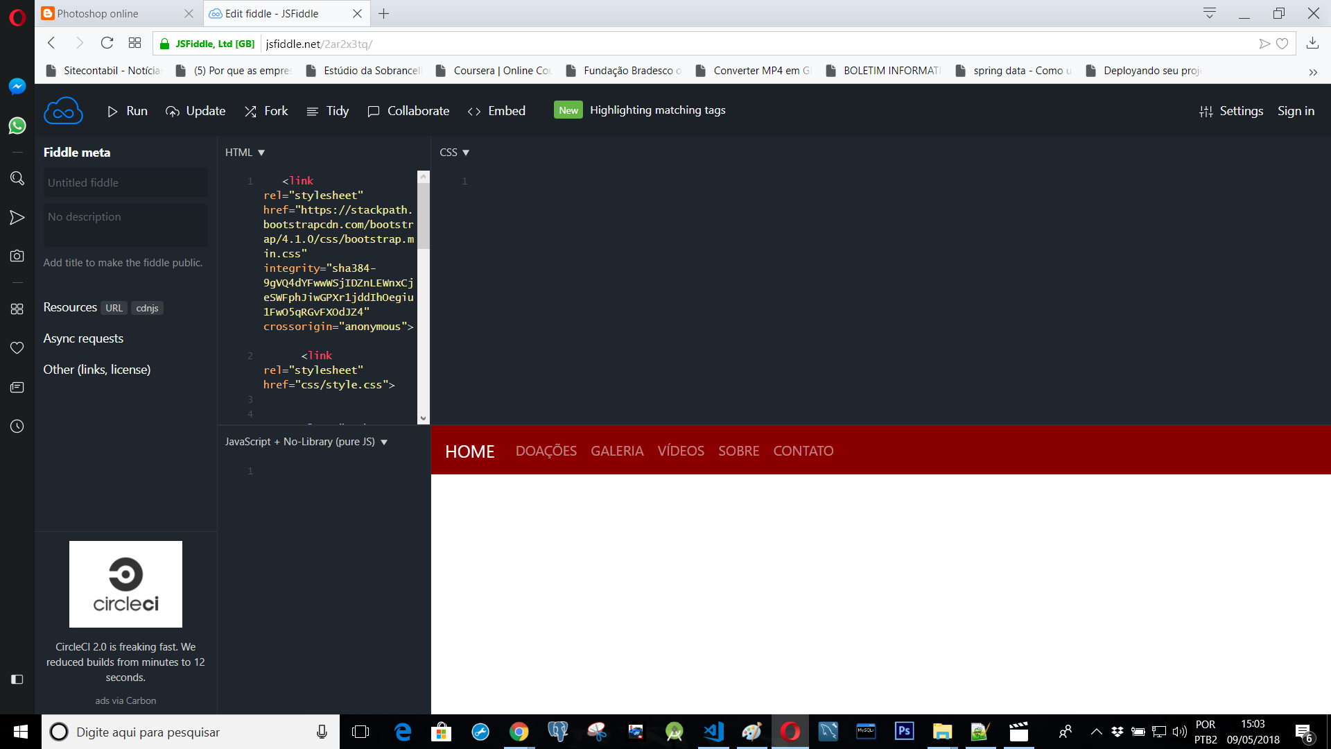
Look at the image;
Click here
How do I make this menu stay in the middle of the screen? The difficulty exists because I'm using Bootstrap 4, I've tried everything.
I wanted it to look like this below;
www.esperancapaixao.com
Look at the image;
Click here
How do I make this menu stay in the middle of the screen? The difficulty exists because I'm using Bootstrap 4, I've tried everything.
I wanted it to look like this below;
www.esperancapaixao.com
In the official documentation the .justify-content-md-center class is used to do this. Official examples link link
See how it looks in the example below: OBS: How responsive it has to perform as "Whole Page"
<link rel="stylesheet" type="text/css" media="screen" href="https://maxcdn.bootstrapcdn.com/bootstrap/4.0.0-beta.2/css/bootstrap.min.css"/>

    <nav class="navbar navbar-expand-lg navbar-dark bg-dark">
        <button class="navbar-toggler" type="button" data-toggle="collapse" data-target="#navbarsExample08" aria-controls="navbarsExample08"
            aria-expanded="false" aria-label="Toggle navigation">
            <span class="navbar-toggler-icon"></span>
        </button>

        <div class="collapse navbar-collapse justify-content-md-center" id="navbarsExample08">
            <ul class="navbar-nav">
                <li class="nav-item active">
                    <a class="nav-link" href="#">Centered nav only
                        <span class="sr-only">(current)</span>
                    </a>
                </li>
                <li class="nav-item">
                    <a class="nav-link" href="#">Link</a>
                </li>
                <li class="nav-item">
                    <a class="nav-link disabled" href="#">Disabled</a>
                </li>
                <li class="nav-item dropdown">
                    <a class="nav-link dropdown-toggle" href="http://example.com" id="dropdown08" data-toggle="dropdown" aria-haspopup="true"
                        aria-expanded="false">Dropdown</a>
                    <div class="dropdown-menu" aria-labelledby="dropdown08">
                        <a class="dropdown-item" href="#">Action</a>
                        <a class="dropdown-item" href="#">Another action</a>
                        <a class="dropdown-item" href="#">Something else here</a>
                    </div>
                </li>
            </ul>
        </div>
    </nav>

    <script src="https://code.jquery.com/jquery-3.2.1.slim.min.js"></script><scriptsrc="https://cdnjs.cloudflare.com/ajax/libs/popper.js/1.12.3/umd/popper.min.js"></script>
<script src="https://maxcdn.bootstrapcdn.com/bootstrap/4.0.0-beta.2/js/bootstrap.min.js"></script><scriptsrc="https://maxcdn.bootstrapcdn.com/bootstrap/4.0.0-beta.3/js/bootstrap.bundle.min.js"></script> Where you have the menu listing, if you go see the source code, you see that ul has margin-right:auto !important , that is, it will hit the left side. Then just add a style with the following code.
<ul class="navbar-nav mr-auto" style="margin: auto!important">
And to put HOME next to the other menus, you have to change it to ul but it will disappear in mobile view and appear next to menus