There is a way to do this, using CSS transformations ( transform ), as I discovered in StackOverflow (English) , with some cons:
-
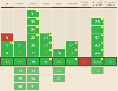
is not compatible with all browsers: Can I use CSS Transforms
Ihadtoaddsomemarkuptoitsoriginal,soIthinkI'vebrokenthesemantics...adivs,aroundeachgroupdt+dd.
/li>Theselectionoftext,youhaveproblems,becausethebrowserthinksthatwhatisbelow,comesbeforeintheselectionarea
The solution
.faq {
  -webkit-transform: scaleY(-1);
  transform: scaleY(-1);
}
.faq > * {
  -webkit-transform: scaleY(-1);
  transform: scaleY(-1);
}
.faq {
  counter-reset: my-counter 0;
}
.faq dd {
  margin: 0 0 50px;
}
.faq dt:before {
  content: counter(my-counter, decimal-leading-zero)".";
  font: bold 50px/1 Sans-Serif;
  left: 0;
  position: absolute;
  top: 5px;
}
.faq dt,
.faq dd {
  padding-left: 90px;
}
.faq dt {
  counter-increment: my-counter 1;
  font: bold 16px Georgia;
  padding: 4px 0 10px 90px;
  position: relative;
}
body {
  padding: 20px;
  background-color: #eee;
}
<dl class="faq">
  <div>
    <dt>Como colocar o umbigo pra dentro?</dt>
    <dd>Aperte o umbago com o dedão. Fonte: Wikipedia.</dd>
  </div>
  <div>
    <dt>Onde eu baixo um processador dual core?</dt>
    <dd>AMD ou IBM?</dd>
  </div>
  <div>
    <dt>Carne vermelha faz mal, carne branca faz mal, o que devo comer?</dt>
    <dd>Carne humana.</dd>
  </div>
  <div>
    <dt>Quando devo falar sobre sexo com meu cachorro?</dt>
    <dd>Quando ele entrar na puberdade.</dd>
  </div>
</dl>
How does it work?
The principle is to invert the vertical coordinate system, using CSS transformations:
transform: scaleY(-1)
This will invert the Y axis, which is traditionally the vertical axis.
So step by step, this is what happens:
If we apply this transformation only once, then what happens is that everything inside the element with the applied style is upside down. In case, we first apply the transformation to the element that includes the entire list:
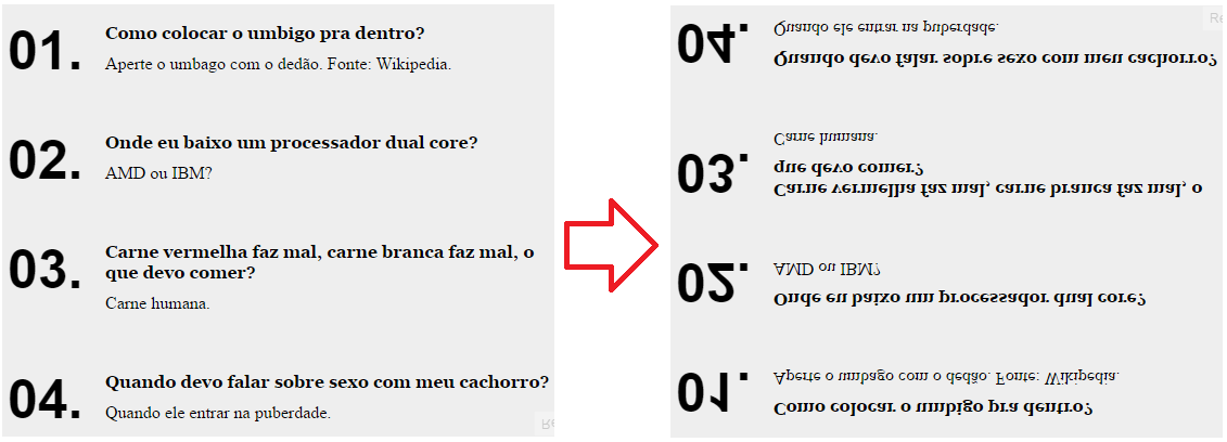
Itturnsoutthatnow,eachofthesub-elementsisgourddown.Sowhatwehavetodoistoinverteachofthemindividually,whichinpracticewilldisinvestthem:


