Placing a background image and making it responsive

9

I'm having a problem putting a background image on my page. I did some testing and it stays that way when I change the size of the window:

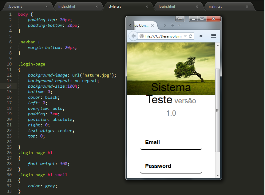
WhenIgetmaximized,it'sright:

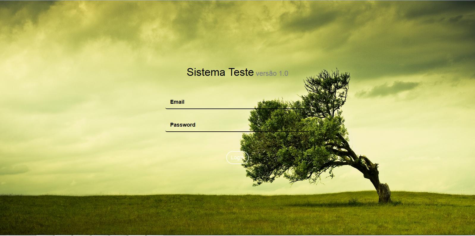
HowcanIadjustthisimagetogetthescreencorrectly?

CSS:

.login-page{background-image:url('nature.jpg');background-repeat:no-repeat;background-size:100%;bottom:0;color:black;left:0;overflow:auto;padding:3em;position:absolute;right:0;text-align:center;top:0;}.login-pageh1{font-weight:300;}.login-pageh1small{color:gray;}.login-page.form-group{padding:8px0;}.login-page.form-content{padding:40px0;}

Page:

<html><head><metacharset="utf-8">
    <title>Meus Contatos</title>
    <meta name="description" content="">
    <meta name="viewport" content="width=device-width">
    <link rel="stylesheet" href="public/libs/bootstrap/dist/css/bootstrap.css"/>
    <link rel="stylesheet" href="public/styles/style.css"/>

</head>
<body>
    <div class=login-page>

   <div class=row>
      <div class="col-md-4 col-lg-4 col-md-offset-4 col-lg-offset-4">
        </br>
        </br>
        </br>
        </br>
        </br>
        </br>
        </br>
        </br>
         <h1>Sistema Teste<small> versão 1.0</small></h1>
         <form role=form ng-submit=submit()>
            <div class=form-content>
               <div class=form-group> <input type=text class="form-control input-underline input-lg" placeholder=Email> </div>
               <div class=form-group> <input type=password class="form-control input-underline input-lg" placeholder=Password> </div>
            </div>
            <button type=submit class="btn btn-white btn-outline btn-lg btn-rounded">Login</button> 
         </form>
      </div>
   </div>
</div>
</body>
<html>
    
asked by anonymous 17.09.2015 / 13:41

2 answers

8

You can only add the background-size: cover; property to your css .


Cover: specifies that the background image should be sized so that it is as small as possible while ensuring that both dimensions are greater than or equal to the corresponding dimension of the container. / p>

It would look like this css :

    .login-page
{
    background-image: url('nature.jpg');
    background-repeat: no-repeat;
    background-size:100%;
    bottom: 0;
    color: black;
    left: 0;
    overflow: auto;
    padding: 3em;
    position: absolute;
    right: 0;
    text-align: center;
    top: 0;
    background-size: cover;
}

See an example in JSFiddle.

If you want to learn more, see here.

Edit

You can also call the image according to the resolution using Media Queries This way, you choose the resolution for the image to be called. So you need to have a "treated" image for each resolution. An example would look like this:

@media (min-width: 768px) {
    .login-page
{
    background-image: url('img200.jpg');
    background-repeat: no-repeat;
    bottom: 0;
    color: black;
    left: 0;
    overflow: auto;
    padding: 3em;
    position: absolute;
    right: 0;
    text-align: center;
    top: 0;
    background-repeat: no-repeat;
    background-position: center;
    background-size: cover;


}
}

@media (min-width: 992px) {
  .login-page
{
    background-image: url('img600.jpg');
    background-repeat: no-repeat;
    bottom: 0;
    color: black;
    left: 0;
    overflow: auto;
    padding: 3em;
    position: absolute;
    right: 0;
    text-align: center;
    top: 0;
    background-repeat: no-repeat;
    background-position: center;
    background-size: cover;


}
}

@media (min-width: 1200px) {
   .login-page
{
    background-image: url('img1000.jpg');
    background-repeat: no-repeat;
    bottom: 0;
    color: black;
    left: 0;
    overflow: auto;
    padding: 3em;
    position: absolute;
    right: 0;
    text-align: center;
    top: 0;
    background-repeat: no-repeat;
    background-position: center;
    background-size: cover;


}
}

In this way, a device with a resolution of less than 768px will use img200.jpg , and so on. If you notice, Bootstrao already has media queries , and can even customize the resolutions.

Note: Instead of decreasing the browser size, use the developer tools (F12) and choose the desired device.

    
17.09.2015 / 15:07
1

Have you ever tried using background-size this way?

background-size:100% 100%;

or this way:

background-size:auto 100%;

You can also use this mode:

html { 
   background: url(images/bg.jpg) no-repeat center center fixed; 
   -webkit-background-size: cover;
   -moz-background-size: cover;
   -o-background-size: cover;
   background-size: cover;
}

Example: link
Website where I found the answer: link

    
17.09.2015 / 13:54