How do one column occupy the rest of the available space?

9

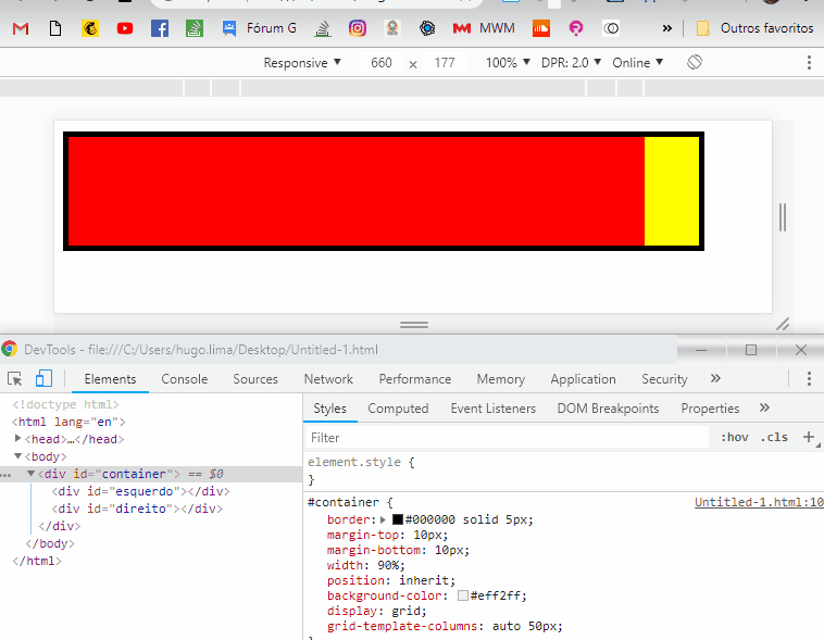
I would like two blocks within a parallel-sized div, one with a fixed size, and another that fits exactly in the remaining space.

For example:

div#container {
  width: 50%; /* este tamanho se altera */
  height: 100px;
}

#esquerdo {
  width: 100%
  height: 100px;
}
#direito {
  width: 40px;
  height: 100px;
}

I want the #left and #right tiles side by side to fill the container. see here: link

What should I do?

    
asked by anonymous 08.04.2015 / 06:27

3 answers

6

You can do this with Flexbox:

  • Make #container have flex layout:

    div#container {
        display: flex;
    
  • The left-hand element, whose size should occupy the maximum space available, establishes that it grows freely:

    #esquerdo {
        /*width: 100%*/
        flex-grow: 1;
    
  • The right side is unchanged - the default value for flex-grow is zero,

    Example in jsFiddle .

        
  • 08.04.2015 / 08:31
    4

    You can do this with float , simply change the order of elements in HTML ... direito should come first and esquerdo after:

    /* ESTILOS IMPORTANTES PARA A RESPOSTA */
    #esquerdo {
        height: 100px;
        overflow: hidden;
    }
    #direito {
        width: 50px;
        height: 100px;
        float: right;
    }
    
    
    /* ESTILOS AUXILIARES */
    #container {
        border: #000000 solid 5px;
        margin-top: 10px;
        margin-bottom: 10px;
        width: 90%;
    }
    #esquerdo {
        background-color: red;
        overflow: hidden;
        border: 2px solid darkred;
        box-sizing: border-box;
    }
    #direito {
        background-color: yellow;
        border: 2px solid darkolivegreen;
        box-sizing: border-box;
    }
    <div id="container">
        <div id="direito">direito</div>
        <div id="esquerdo">esquerdo</div>
        container
    </div>
        
    08.04.2015 / 12:36
    0

    I'll give you one more option by using display:grid and as grid-template-columns: auto 50px; I leave the left column with width auto , 100% of available space, and the right column has value fixo de 50px .

    Codereferringtotheimageabove

    #container {
        border: #000000 solid 5px;
        margin-top: 10px;
        margin-bottom: 10px;
        width: 90%;
        position: inherit;
        background-color: #eff2ff;
        display: grid;
        /* aqui eu defino que o Grid tem Duas colunas uma com width:auto e outra com 50px */
        grid-template-columns: auto 50px; 
    }
    #esquerdo {
        vertical-align: top;
        height: 100px;
        background-color: red;
        display: inline-block;
    }
    #direito {
        vertical-align: top;
        height: 100px;
        background-color: yellow;
        display: inline-block;
    }
    
        
    <div id="container">
        <div id="esquerdo"></div>
        <div id="direito"></div>
    </div>
        
    14.12.2018 / 13:38