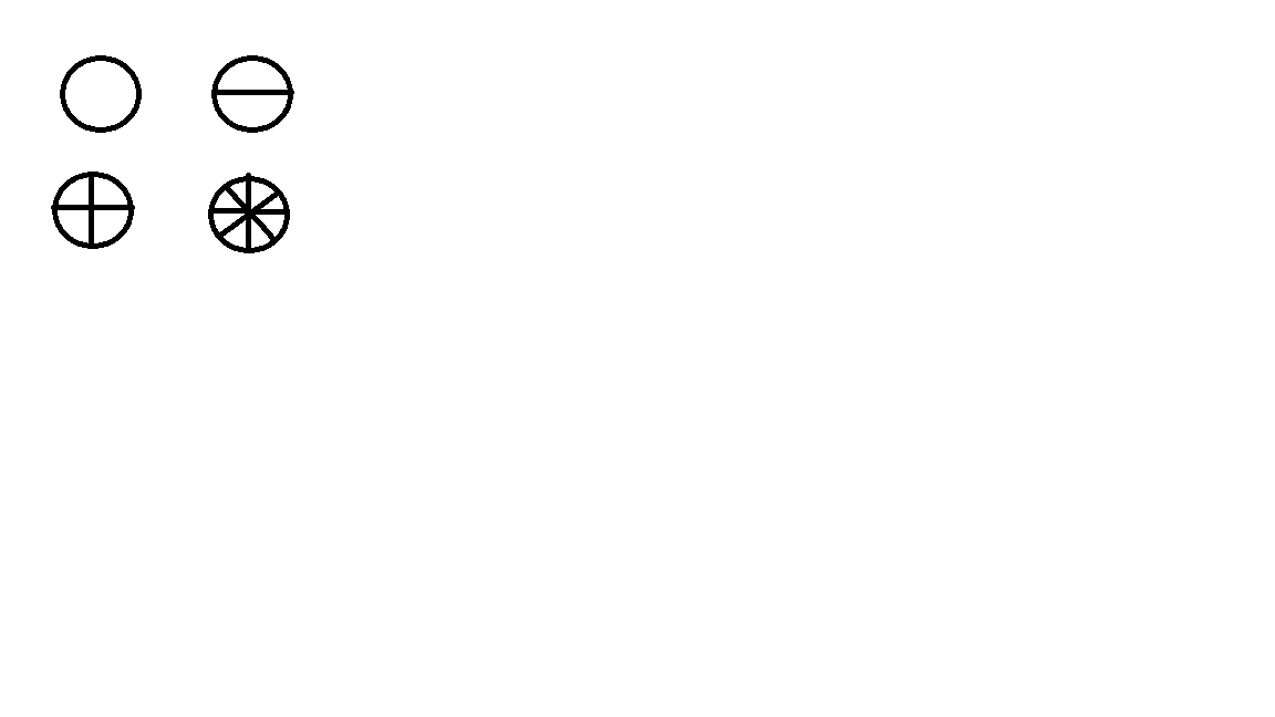
How to draw a pizza using css

2

I'm having trouble making the lines on a round button to match the partitions of a pizza

WhatIhave:

<divclass="panel-body no_padding padding_bottom_top_list" style="display: inline-block;">
                <div class="list-group">
                    <div class="list-group-item list_group_item_padding">
                        <div class="row-action-primary padding_right_list" style="text-align:center">
                            <button class="btn btn-fab  green_status2" style="width:60px; height:60px; font-size:30px; color:white; "></button>
                            </br>
                        </div>
                    </div>
                </div>
            </div>
    
asked by anonymous 15.08.2017 / 17:03

2 answers

6

In this case it would be possible with multiple background + linear gradient:

.btn-fab {
  border: 1px solid #000;
  border-radius: 30px;
}
.btn-pizza-1 {
  background-color: #fff;
}
.btn-pizza-2 {
  background-color: #fff;
  background-image: linear-gradient(to bottom, transparent 49%, #000 49%, #000 51%, transparent 51%);
}
.btn-pizza-3 {
  background-color: #fff;
  background-image: 
    linear-gradient(to right, transparent 49%, #000 49%, #000 51%, transparent 51%),
    linear-gradient(to bottom,transparent 49%, #000 49%, #000 51%, transparent 51%);
}
.btn-pizza-4 {
  background-color: #fff;
  background-image: 
    linear-gradient(to right, transparent 49%, #000 49%, #000 51%, transparent 51%),
    linear-gradient(to bottom,transparent 49%, #000 49%, #000 51%, transparent 51%),
    linear-gradient(45deg,transparent 49%, #000 49%, #000 51%, transparent 51%),
    linear-gradient(135deg,transparent 49%, #000 49%, #000 51%, transparent 51%);
}
<div class="panel-body no_padding padding_bottom_top_list" style="display: inline-block;">
                <div class="list-group">
                    <div class="list-group-item list_group_item_padding">
                        <div class="row-action-primary padding_right_list" style="text-align:center">
                            <button class="btn btn-fab  green_status2 btn-pizza-1" style="width:60px; height:60px; font-size:30px; color:white; "></button>
                            </br>
                            <button class="btn btn-fab  green_status2 btn-pizza-2" style="width:60px; height:60px; font-size:30px; color:white; "></button>
                            </br>
                            <button class="btn btn-fab  green_status2 btn-pizza-3" style="width:60px; height:60px; font-size:30px; color:white; "></button>
                            </br>
                            <button class="btn btn-fab  green_status2 btn-pizza-4" style="width:60px; height:60px; font-size:30px; color:white; "></button>
                            </br>
                        </div>
                    </div>
                </div>
            </div>

Browser Compatibility: link link

    
15.08.2017 / 17:38
0

A suggestion with transform for diagonals, which still is well accepted by browsers :

#base {
  position: relative;
  width: 100px;
  height: 100px;
  border: 1px solid;
  border-radius: 100%;
}
#vert {
  position: absolute;
  width: 0;
  height: 100px;
  border: 1px solid;
  left: 50%;
}
#horz {
  position: absolute;
  width: 100px;
  height: 0;
  border: 1px solid;
  top: 50%;
}
#diag1 {
  position: absolute;
  width: 0;
  height: 100px;
  border: 1px solid;
  transform: rotate(45deg);
  left: 50%;
}
#diag2 {
  position: absolute;
  width: 0;
  height: 100px;
  border: 1px solid;
  transform: rotate(-45deg);
  left: 50%;
}
<div id="base">
  <div id="vert"></div>
  <div id="horz"></div>
  <div id="diag1"></div>
  <div id="diag2"></div>
</div>
    
16.08.2017 / 18:49