Equal shadow effect on gmail login screen

3

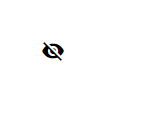
How to do the same shadow effect by clicking on the show / hide password same button you have on the Google login.

I have tried to do with the pseudo-element: before : focus but I did not succeed.

const btn_password = $(".viewPassword .verSenha");
const input_password = $(".viewPassword input");
btn_password.on('click', function() {
  let type = input_password.attr("type");
  if (type == 'password') {
    input_password.prop('type', 'text');
  }
  if (type == 'text') {
    input_password.prop('type', 'password');
  }
  $(this).toggleClass('ic-visibility-off ic-visibility-on');
  if ($(this).hasClass('ic-visibility-off')) {
    $(this).attr('title', 'Mostrar senha');
  } else {
    $(this).attr('title', 'Ocultar senha');
  }

});
.input {
  width: 270px;
  float: left;
  position: relative;
  display: flex;
  align-items: center;
}

.form-control {
  background-color: #f9fafa;
  font-size: 14px;
  font-weight: normal;
  line-height: 1.64;
  letter-spacing: normal;
  color: #4e5159;
  width: 100%;
  padding: 13px 40px 13px 14px;
  border: solid 1px #f3f5f5;
}

.icon-svg {
  background-position: center;
  background-repeat: no-repeat;
  background-size: 100%;
  object-fit: contain;
  position: absolute;
  right: 15px;
  cursor: pointer
}

.ic-visibility-off {
  width: 18.3px;
  height: 15.8px;
  background-image: url('https://webmachado.com.br/assets/svg/ic-visibility-off.svg');
}

.ic-visibility-on {
  width: 18.3px;
  height: 15.8px;
  background-image: url('https://webmachado.com.br/assets/svg/ic-visibility-on.svg');
}
<script src="https://cdnjs.cloudflare.com/ajax/libs/jquery/3.3.0/jquery.min.js"></script><divclass="input viewPassword">
    <i class="icon-svg ic-password"></i>
    <input type="password" class="form-control" name="senha" placeholder="Senha">
    <i class="icon-svg verSenha ic-visibility-off" title="Mostrar senha"></i>
  </div>
    
asked by anonymous 05.12.2018 / 19:47

1 answer

2

My idea here is to use the pseudo-class :active to activate element animation on click only. According to Mozilla, it's not just the <a> or <button> tag that can :active , actually even a <h1> or <p> tag can receive this pseudo-class / p>

  The pseudo-class tag is also typically matched when using the tab key. It is frequently used on :active and <a> HTML elements, but may not be limited to just those .

PORTUGUESE "The pseudo-class <button> is also commonly used when using the tab key on the keyboard.It is often used in HTML elements :active and <a> but may not be limited to them.

Source: link

Now let's get down to business.

As said <button> can be used on various elements, then I used a :active with a <label> to trigger a for that depending on the checkbox state or will not change the " ". Now with :checked I'll fire the animation whenever the element is clicked.

Within:activeIhavetwoicons,oneishiddenandtheotherappearing,whenIchangethelabeltocheckboxIhidetheiconthatwasvisibleandhiddenwhatwasalreadyappearing.>

Viewthemodeltemplatecode:

label {
	margin: 40px;
	height: 24px;
	width: 24px;
	border-radius: 50%;
	display: flex;
	justify-content: center;
	align-items: center;
	cursor: pointer;
	user-select: none;
}
label:active::before {
	content: "";
	width: 0px;
	height: 0px;
	background-color: rgba(0, 0, 0, 0.35);
	border-radius: 50%;
	position: absolute;
	z-index: -1;
	filter: blur(5px);
	animation: anima 250ms forwards linear;
}
@keyframes anima {
	50% {
		width: 40px;
		height: 40px;
	}
}

input:checked + label i.sim{
	display: block !important;
}
input:checked + label i.nao{
	display: none;
}
.sim {
	display: none !important;
}
.nao {
	bottom: block;
}
input {
	display: none;
}
<link href="https://fonts.googleapis.com/icon?family=Material+Icons" rel="stylesheet">

<input type="checkbox" name="" id="efeito">
<label for="efeito" class="btnx">
		<i class="material-icons sim">visibility</i>
		<i class="material-icons nao">visibility_off</i>
</label>
    
06.12.2018 / 01:45