I have a project and this project was all done from scratch on my PC, however when I took my project to another PC that had a totally different display resolution of mine, the images and certain texts that I put were out of place that they should stay.
Does anyone have a solution to this problem?
Some way that, regardless of the resolution, the images and texts appear in a certain way, because I had a look if there was any solution to this problem and only for Android (Layout on another device ) but I'm working with Windows and as it has a way for Android to have for Windows.
I have tried to put the image in different ways, implementing it in the body of the HTML with the tag "img" and the CSS with the background thinking that my error was in the form of putting the image but independent of the way has been placed this problem remains.
My HTML file:
<div id="image-rodape">
<img src="imagens/rodape.png" />
<p class="texto_rodape">By: Matheus Wallace ©Copyright,TIPI 02/EBEP Maceió. Todos os direitos reservados.</p>
</div>
My CSS file:
div#image-rodape img {
  position: absolute;
  display: block;
  top: 1235px;
  left: 390px;
  margin-bottom: 10px;
}
NOTE: I'm working on my layout with images, both in the menu part and in the sidebar, in my footer and the texts placed in it are all leaving the place when the resolution of the monitor is different.
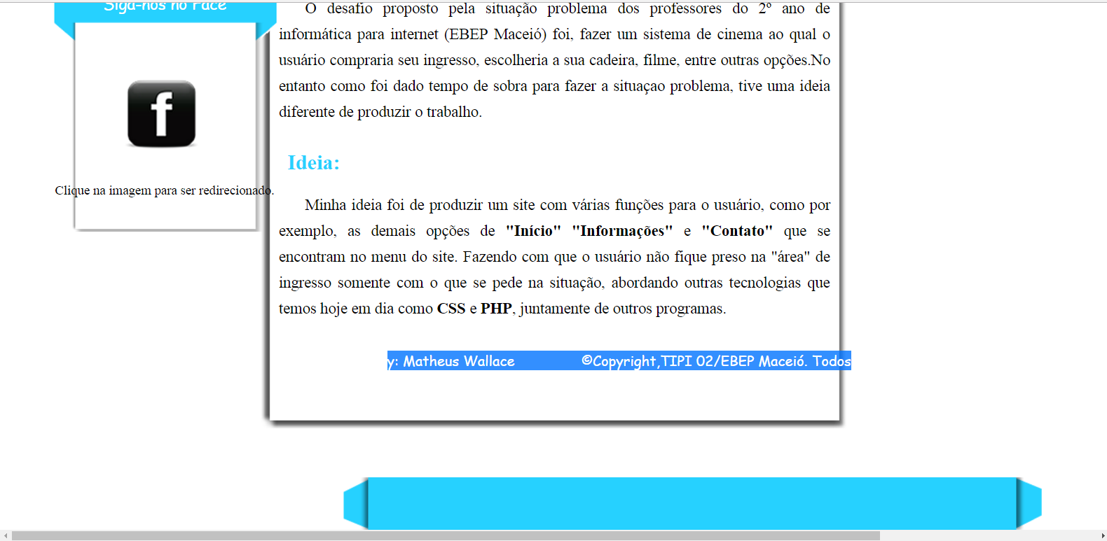
Image on my PC:
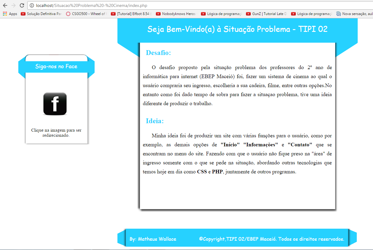
ImageonanotherPC: