


Someone can help me I have this code using SASS but as I'm developing in Synfony I have not been using SASS for a number of reasons.
The code is this: insert link description here
Can you help me do something like this with CSS?
Someone can help me I have this code using SASS but as I'm developing in Synfony I have not been using SASS for a number of reasons.
The code is this: insert link description here
Can you help me do something like this with CSS?
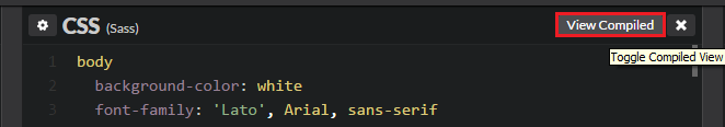
As mentioned by @Caio Felipe Pereira . In the CSS frame bar there is a button with the option to see the compiled SASS code for CSS.
Inanycase,itfollowsthecompiledcodeaswell.
body{background-color:white;font-family:"Lato", Arial, sans-serif;
  text-align: center;
  padding-top: 50px;
}

h1 {
  font-size: 1.5em;
  color: #666;
}

h2, a {
  font-size: 0.8em;
  color: #00B285;
}

.spinners {
  margin: 60px auto;
}
.spinners .row {
  height: 50px;
  padding: 10px 0;
}

/* ============================ */
/* VARIABLES                    */
/* ============================ */
/* ============================ */
/* SPINNER GENERAL              */
/* ============================ */
.spinner, .spinner:before, .spinner:after {
  width: 4px;
  height: 20px;
  background-color: #00B285;
  border-radius: 2px;
}

.spinner {
  display: inline-block;
  position: relative;
}
.spinner:before, .spinner:after {
  content: "";
  position: absolute;
  display: block;
  top: 0px;
}
.spinner:before {
  left: -6px;
}
.spinner:after {
  left: 6px;
}

/* ============================ */
/* SPINNER BOUNCE BOTTOM        */
/* ============================ */
@-webkit-keyframes bounce-bottom {
  0% {
    height: 5px;
    margin-top: 15px;
  }
  50% {
    height: 20px;
    margin-top: 0px;
  }
  100% {
    height: 5px;
    margin-top: 15px;
  }
}
@keyframes bounce-bottom {
  0% {
    height: 5px;
    margin-top: 15px;
  }
  50% {
    height: 20px;
    margin-top: 0px;
  }
  100% {
    height: 5px;
    margin-top: 15px;
  }
}
.spinner-bounce-bottom {
  -webkit-animation: bounce-bottom 0.6s ease 0.1s infinite;
          animation: bounce-bottom 0.6s ease 0.1s infinite;
}
.spinner-bounce-bottom:before, .spinner-bounce-bottom:after {
  top: auto;
  bottom: 0px;
}
.spinner-bounce-bottom:before {
  -webkit-animation: bounce-bottom 0.6s ease 0s infinite;
          animation: bounce-bottom 0.6s ease 0s infinite;
}
.spinner-bounce-bottom:after {
  -webkit-animation: bounce-bottom 0.6s ease 0.2s infinite;
          animation: bounce-bottom 0.6s ease 0.2s infinite;
}

/* ============================ */
/* SPINNER BOUNCE TOP        */
/* ============================ */
@-webkit-keyframes bounce-top {
  0% {
    height: 5px;
    margin-bottom: 15px;
  }
  50% {
    height: 20px;
    margin-bottom: 0px;
  }
  100% {
    height: 5px;
    margin-bottom: 15px;
  }
}
@keyframes bounce-top {
  0% {
    height: 5px;
    margin-bottom: 15px;
  }
  50% {
    height: 20px;
    margin-bottom: 0px;
  }
  100% {
    height: 5px;
    margin-bottom: 15px;
  }
}
.spinner-bounce-top {
  -webkit-animation: bounce-top 0.6s ease 0.1s infinite;
          animation: bounce-top 0.6s ease 0.1s infinite;
}
.spinner-bounce-top:before {
  -webkit-animation: bounce-top 0.6s ease 0s infinite;
          animation: bounce-top 0.6s ease 0s infinite;
}
.spinner-bounce-top:after {
  -webkit-animation: bounce-top 0.6s ease 0.2s infinite;
          animation: bounce-top 0.6s ease 0.2s infinite;
}

/* ============================ */
/* SPINNER BOUNCE MIDDLE        */
/* ============================ */
@-webkit-keyframes bounce-middle {
  0% {
    height: 4px;
    margin-top: 8px;
    margin-bottom: 8px;
  }
  50% {
    height: 20px;
    margin-top: 0px;
    margin-bottom: 0px;
  }
  100% {
    height: 4px;
    margin-top: 8px;
    margin-bottom: 8px;
  }
}
@keyframes bounce-middle {
  0% {
    height: 4px;
    margin-top: 8px;
    margin-bottom: 8px;
  }
  50% {
    height: 20px;
    margin-top: 0px;
    margin-bottom: 0px;
  }
  100% {
    height: 4px;
    margin-top: 8px;
    margin-bottom: 8px;
  }
}
.spinner-bounce-middle {
  -webkit-animation: bounce-middle 0.6s ease 0.1s infinite;
          animation: bounce-middle 0.6s ease 0.1s infinite;
}
.spinner-bounce-middle:before, .spinner-bounce-middle:after {
  top: 50%;
  -webkit-transform: translateY(-10px) translateZ(0);
          transform: translateY(-10px) translateZ(0);
}
.spinner-bounce-middle:before {
  -webkit-animation: bounce-middle 0.6s ease 0s infinite;
          animation: bounce-middle 0.6s ease 0s infinite;
}
.spinner-bounce-middle:after {
  -webkit-animation: bounce-middle 0.6s ease 0.2s infinite;
          animation: bounce-middle 0.6s ease 0.2s infinite;
}

/* ============================ */
/* SPINNER BLINK                */
/* ============================ */
@-webkit-keyframes glow {
  0% {
    background-color: transparent;
  }
  50% {
    background-color: #00B285;
  }
  100% {
    background-color: transparent;
  }
}
@keyframes glow {
  0% {
    background-color: transparent;
  }
  50% {
    background-color: #00B285;
  }
  100% {
    background-color: transparent;
  }
}
.spinner-blink {
  -webkit-animation: glow 0.6s 0.1s infinite;
          animation: glow 0.6s 0.1s infinite;
}
.spinner-blink:before {
  -webkit-animation: glow 0.6s 0s infinite;
          animation: glow 0.6s 0s infinite;
}
.spinner-blink:after {
  -webkit-animation: glow 0.6s 0.2s infinite;
          animation: glow 0.6s 0.2s infinite;
}