What is the difference between col-lg- *, col-md- * and col-sm- * in Bootstrap?

10

It's been a while since I used Bootstrap I worked with almost all versions. Usually to structure my applications I use Bootstrap's grid system, row to create rows and col- for columns.

I would like to know:

  • The difference between col-lg-* , col-md-* and col-sm-*
  • Under what circumstances should they be used
  • In case of inappropriate use of these elements what problems may arise?
asked by anonymous 05.02.2017 / 12:33

3 answers

14

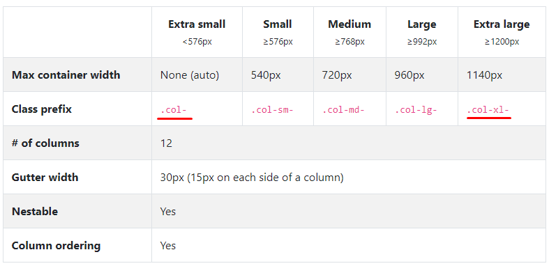
In the Bootstrap documentation itself there is a comparative table between grid classes.

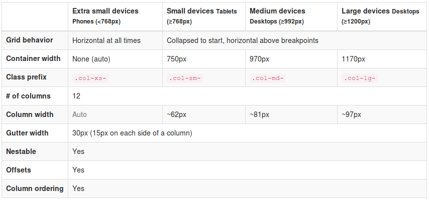
Thatis,the.col-xs-*classsetsthegridfordeviceswithascreenwidthoflessthan768px.Class.col-sm-*setsforscreensgreaterthan768px.Class.col-md-*setsforscreensgreaterthan970pxandclass.col-lg-*forscreensgreaterthan1200px.It'sbasicallyusedtodefinedifferentgridsforyourelement,basedonthesizeofyouruser'sdisplay.

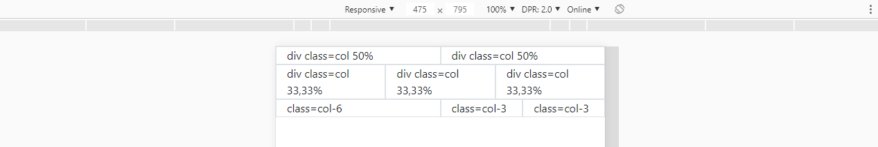
Forexample,youmaywanttodisplayasectorofyoursiteintwocolumnsonmonitors,settingthe.col-sm-6classtoeach.However,onsmall-screendeviceslikecellphones,twocolumnsmaynotbeideal,leavingthecontentsqueezedandsmall,soyoucandefinethatinthesedevices,insteadoftwocolumns,thissectorisinonlyonecolumn,withtheclass.col-xs-12.

Basicallyyouaretellingthebrowser:iftheuser'sscreenhasawidthgreaterthanorequalto768px,displaythisdivoccupying6ofthe12columnsofmygrid.Already,ifthewidthislessthan768px,displayitbyoccupying12ofthe12gridcolumns.

<divclass="col-xs-12 col-sm-6">...</div>

This is a very useful feature especially when you have, for example, a list of products in a virtual store. You can define how many products appear per row in each display by setting the column size.

<div class="col-xs-12 col-sm-4 col-md-3 col-lg-2">{Produto}</div>

Thus, 1 product would appear for extra small devices , occupying 12 of 12 columns of the grid, 3 products in small devices , occupying 4 of 12 columns, 4 products in medium devices , occupying 3 of 12 columns and 6 products in large devices , occupying 2 of 12 columns.


Personal Note: The grid system is, in the form presented, the main functionality of Bootstrap implementing the Mobile First philosophy and responsiveness. If you already use it and did not know such a difference, I recommend that you study the documentation a little more before continuing or searching for another method of study. (Take this as a positive review)

    
05.02.2017 / 13:22
3

Bootstrap attributes that will define the size of the grid, relative to the size of the device, are breakpoints :

col-xs-* extrasmall < 768 px

col-sm-* small >= 768 px

col-md-* medium >= 992 px

col-lg-* large >= 1200 px

Regarding the question:

Under what circumstances should it be used?

Because it is layout, it is broad to respond, but overall when you want a grid that fits these breakpoints patterns.

And the inappropriate use, the only problem is in your layout.

    
05.02.2017 / 12:54
2

Now with the official version of Bootstrap being versão 4 , I believe the answer merits an update.

Follow the link to the official summer 4 grid documentation: link

In the image below note that in red I marked the new grid fractionation models, which now has the class .col-xl- for screens greater than 1200px and with class col- which can be used simply as class="col" to occupy 100% of the width if you do not have another col on your side, or% with% if you want it to be only 50% of the screen width.

Moredetails

Theversion3gridwasbasedonclass="col-6" to position the columns side by side. But in version 4 the grid is made with float:left which greatly facilitates the vertical alignments and makes everything even more responsive.

The display:flex class is defined in this way because the container parent col is with .row

.col {
    flex-basis: 0;
    flex-grow: 1; /* isso faz com que a largura fique "autimática" */
    max-width: 100%;
}

About display:flex : link

If you have flex-grow 2 with divs each takes up 50% of the space, see this example below constructing the grid only with class="col". If they have class="col" 3 each takes divs of space.

<link rel="stylesheet" type="text/css" media="screen" href="https://maxcdn.bootstrapcdn.com/bootstrap/4.1.0/css/bootstrap.min.css" />

<div class="container">
  <div class="row">
<div class="col border">
  div class=col 50%
</div>
<div class="col border">
  div class=col 50%
</div>
  </div>
  <div class="row">
<div class="col border">
  div class=col 33,33%
</div>
<div class="col border">
  div class=col 33,33%
</div>
<div class="col border">
  div class=col 33,33%
</div>
  </div>
  <div class="row">
<div class="col-6 border">
  class=col-6
</div>
<div class="col-3 border">
  class=col-3
</div>
<div class="col-3 border">
  class=col-3
</div>
  </div>
</div>

When the element has class 1/3 , it will always have that width col-n° independent of the width of the screen, so a div will always occupy 50% of screen width, if the screen has 200px or 2000px.


OBS:

Theremainderofthegrid'sbehaviorinversion4isconsistentwith@AndersonCarlosWoss'sresponseandstillfollowsthesefractionalprinciplesasheexplainedintheotheranswer.

Beingthat

That:

<divclass="col-xs-12 col-sm-4 col-md-3 col-lg-2">{Produto}</div>

Now that's it:

<div class="col-12 col-sm-4 col-md-3 col-lg-2">{Produto}</div>

As already mentioned, any% with has ceased to exist , and should now be replaced with class="col-6" number .

    
21.12.2018 / 15:43