How to animate a Radial-Gradient or Linear Gradient with CSS?

3

I'm trying to make an animation with CSS that would be a "sun" going through an image.

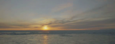
The idea was to have something next of this result:

Butinmycodethe"sun" jumps from side to side and does not get animated in the right way. How do I animate with CSS this readial-gradient (or linear-gradiente ) in the correct way?

I tried to use @keyframes and change properties

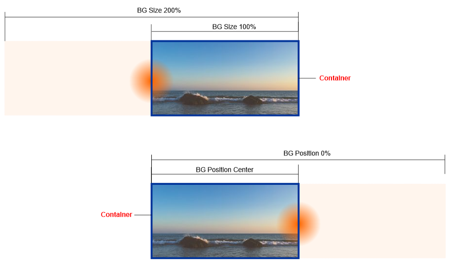
From: radial-gradient(circle at 100% 50%...

To: radial-gradient(circle at 0% 50%...

But it did not work out as you can see below

    
.box {
    width: 300px;
    height: 150px;
    background-image: radial-gradient(circle at 100% 50%, rgba(255, 155, 61, 0.473), transparent 25%), url(https://unsplash.it/300/150?image=986);
    background-size: cover;
    background-repeat: no-repeat;
    animation: bg 3s linear infinite, none;
}
@keyframes bg {
    to {
    background-image: radial-gradient(circle at 0% 50%, rgba(255, 155, 61, 0.473), transparent 25%), url(https://unsplash.it/300/150?image=986);
    }
}
<div class="box"></div>
    
asked by anonymous 11.12.2018 / 16:23

2 answers

2

With @keyframe you can tell the animation when to perform this action using percentage values. That would be the phases of the animation and these values are you that defines.

Following more or less what you need:

    
.box {
    width: 300px;
    height: 150px;
    background-image: radial-gradient(circle at 100% 50%, rgba(255, 155, 61, 0.473), transparent 25%), url(https://unsplash.it/300/150?image=986);
    background-size: cover;
    background-repeat: no-repeat;
    animation: bg 3s linear infinite, none;
}
@keyframes bg {
    0%{
       background-image: radial-gradient(circle at 0% 50%, rgba(255, 155, 61, 0.473), transparent 25%), url(https://unsplash.it/300/150?image=986);
    }
    15%{
       background-image: radial-gradient(circle at 30% 50%, rgba(255, 155, 61, 0.473), transparent 25%), url(https://unsplash.it/300/150?image=986);
    }
    30%{
       background-image: radial-gradient(circle at 30% 50%, rgba(255, 155, 61, 0.473), transparent 25%), url(https://unsplash.it/300/150?image=986);
    }
    50%{
       background-image: radial-gradient(circle at 50% 60%, rgba(255, 155, 61, 0.473), transparent 25%), url(https://unsplash.it/300/150?image=986);
    }
    75%{
       background-image: radial-gradient(circle at 75% 60%, rgba(255, 155, 61, 0.473), transparent 25%), url(https://unsplash.it/300/150?image=986);
    }
    90%{
       background-image: radial-gradient(circle at 90% 50%, rgba(255, 155, 61, 0.473), transparent 25%), url(https://unsplash.it/300/150?image=986);
    }
}
<div class="box"></div>

As I commented, I was able to find examples similar to the one below, working the background and the gradient separately:

.box {
    width: 300px;
    height: 150px;
    background-image: url(https://unsplash.it/300/150?image=986);
    position: relative;
}

.sol{
    width: 100%;
    height: 100px;
    background-image: radial-gradient(circle, rgba(255, 155, 61, 0.473), transparent 25%);
    background-position: 110px 0px;
    position: absolute;
    background-repeat: none;
    -webkit-animation: sol 5s ease infinite; 
}

@-webkit-keyframes sol {
  from{
    background-position: 110px 0px;
  }
  to{
    background-position: -110px 0px;
  }
}
<div class="box"><div class="sol"></div></div>
    
11.12.2018 / 17:07
2

I came up with a solution using background-size and background-position .

The idea is that you have a background that is larger than 100% of the container size. To do this, just put values like background-size:200% or 300%, after that as background-position you put bg to one side or the other.

Seethecodetobetterunderstand:

.box {
  width: 300px;
  height: 150px;
  background-image: radial-gradient(circle, rgba(255, 166, 0, 0.7), transparent 25%), url(https://unsplash.it/300/150?image=986);
  background-size: 200% 100%, cover;
  background-position: 100% 50%, center;
  background-repeat: no-repeat;
  animation: bg 3s linear infinite, none;
}
@keyframes bg {
  to {
    background-position: 0% 50%;
  }
}
<div class="box"></div>
    
12.12.2018 / 20:01