


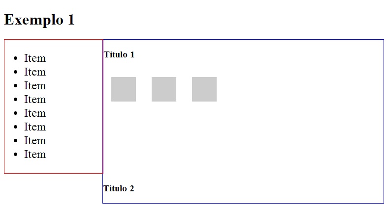
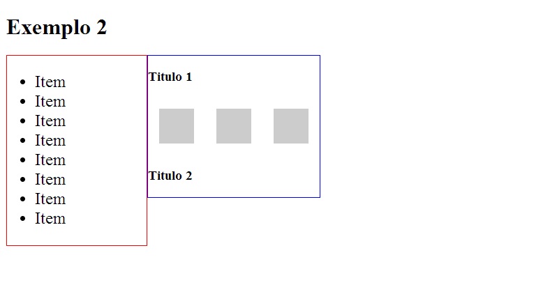
I'm making a layout that will have two columns, the first one on the left will compose a menu a second will occupy all the remaining space on the screen on the right side and it will stay in the content.
In developing the css of these columns I came across the following problem the first column (.sidebar) is float left the second (.maincontent) not, since the width will have to be responsive though putting content within .maincontent a content line break corresponds to the size of the .sidebar so the content orientation in the .maincontent was wrong, the line break was too large and disproportionate, to try to solve this problem set the .maincontent as float left and ready the problem has apparently been solved but suddenly another one appeared, the width of the .maincontent was proportional to the content instead of occupying the remaining screen space, and I am not able to solve this problem leaving the line break of the right .maincontent and independent and responsive width.
For a better understanding, I'll attach the Screenshots and examples to jsfiddle.net
Link of jsfiddle editable example
Editable example link jsfiddle
I would like a solution without having to use width as a percentage as in this dashboard dashboard .
>