Change banner according to screen size?

3

For the best performance in load time of my site I wanted to make the incoming page banner smarter.

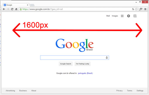
For screens up to 1600px would have to be loaded with a simpler, lower quality and smaller side banner, since it does not have to be bigger, but for screens larger than that I would bring a banner with more detail and better resolution.

AssumingIhada<imgid="banner"> how could I make this move to change src dynamically?

Is it commonplace on websites these days?

    
asked by anonymous 10.04.2015 / 16:04

2 answers

5

Yes, quite normal. you can deal in layers of css or js. Nowadays js offers a lot of support for screen resize, with components in jquery ui. if you need to change size, bg, and component layout, I suggest you use CSS as follows:

#div{
   width: 600px;
   position: relative;
   margin: 10px auto;
}
@media (max-width:960px){
#div{
     width: 450px;
     margin: 0; 
    }
 }
 @media (min-width:480px){
#div{
     width: 100%;
     margin: 0; 
    }
 }

so you can make "if" species within the css for each maximum or minimum screen size. overwriting just what to change from parsons css.  Tools like Bootstrap help to manipulate elements on screen with css based already written and quite responsive to the standard screen sizes.

    
10.04.2015 / 16:27
2

If you want to do in javascript:

// convém estar no onload da janela
window.onload = function()
{

  // primeiro tens de sacar a dimensão da janela
  // neste caso a área visível do browser
  var largura = Math.max(document.documentElement.clientWidth, window.innerWidth || 0);

  // depois é brincar com if's e colocar o banner que queiras:

  if(largura>=1600)
  {
    // mete o banner com mais detalhe
  } else {
    // mete o banner com menos detalhe
  }
} // fim do window.onload
    
10.04.2015 / 17:02