Div diagonal mosaic in CSS

3

I need to create a menu with diagonal divs that when passing the mause over color change and each image contains a link to a different category.

The problem is that I can not create a div diagonally, and wanted to find a solution to the problem just by using html and css if possible.

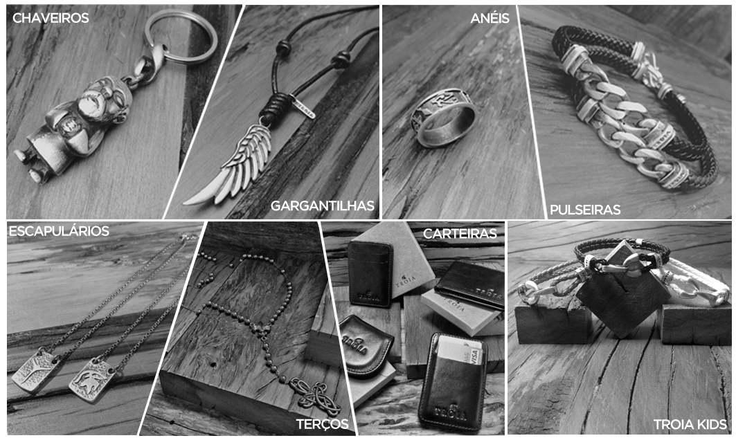
How can I create a mosaic menu like this?

In case just making geometric shapes does not work for me, as it has the background image.

I need to distort the size of the divs to look similar to the image.

Some people are saying that it is duplicate and even voting against my post, so I will show that the problem is not so simple. The problem is much deeper than the geometric shapes because in the border scheme you can not do a background. Just add a background color.

And by skew you can put a background image, but I can not make the images have the correct angle because it distorts the two sides of the angle.

#trapezoid { 
  border-top: 200px solid transparent;
  border-left: 0px solid white;
  border-right: 40px solid white;
  width: 150px;
  float: left;

  background-image: url('http://pongnamuroms.weebly.com/uploads/1/3/3/6/13369650/144214_orig.png');
  opacity: 0.7;
  background-size: calc(100% + 100px);
}

#trapezoid2 { 
  border-bottom: 200px solid transparent;
  border-left: 40px solid white;
  border-right: 0px solid white;
  width: 150px;
  margin-left: -34px;
  float: left;

  background-image: url('http://www.androidspin.com/wp-content/uploads/2015/05/flow_aquablue.png');
  opacity: 0.7;
  background-size: calc(100% + 100px);
}

#trapezoid2:hover{
  opacity: 1;
}

#trapezoid:hover{
  opacity: 1;
}
<div id="trapezoid">

</div>
<div id="trapezoid2">
</div>

<div id="trapezoid3">

</div> 

    
asked by anonymous 03.03.2016 / 20:03

2 answers

5

follow an example using SVG

var trapezio1 = document.getElementById("trapezio1");
var trapezio2 = document.getElementById("trapezio2");

trapezio1.addEventListener("click", function () {
  alert("Parque");
});

trapezio2.addEventListener("click", function () {
  alert("Praia");
});
.trapezio {  
  stroke:black;
  stroke-width:1;
  filter:url("#desaturate")
}

#trapezio1 {
  fill:url(#img1);        
}

#trapezio2 {
  fill:url(#img2);
}

.trapezio:hover  {
  filter: none;
  cursor: pointer;
}
<svg viewBox="0 0 455 250" >
  <polygon id="trapezio1" class="trapezio" points="  0,0 250,0 200,250   0,250" />
  <polygon id="trapezio2" class="trapezio" points="255,0 455,0 455,250 205,250" />      
  <defs>
    <pattern id="img1" width="1" height="1">
      <image xlink:href="http://crossorigin.me/http://www.travelandleisure.com/sites/default/files/field/image/local-experts-shanghai-most-beautiful-parks.jpg" 
             width="250" height="250" />
    </pattern>
    <pattern id="img2" width="1" height="1">
      <image xlink:href="http://crossorigin.me/http://www.travelandleisure.com/sites/default/files/field/image/local-experts-bangkok-best-beaches.jpg" 
             width="250" height="250"/>
    </pattern>
  </defs>
  <filter id="desaturate">
    <feColorMatrix type="matrix" 
                   values="0.3333 0.3333 0.3333 0 0
                           0.3333 0.3333 0.3333 0 0
                           0.3333 0.3333 0.3333 0 0
                           0      0      0      1 0"/>
  </filter>
</svg>
    
04.03.2016 / 15:11
3

You may be interested in the skew method of css3. Let's say you can "skew" your div according to your preferences:

I have my div:

<div id="divteste">olá mundo</div>

And my style sheet:

div {
    width: 300px;
    height: 100px;
    background-color: yellow;
    border: 1px solid black;
}

div#divteste {
    -ms-transform: skew(20deg,10deg); /* IE 9 */
    -webkit-transform: skew(20deg,10deg); /* Safari */
    transform: skew(20deg,10deg); /* Standard syntax */
}

Example in JsFiddle: link

More about the skew method: link

Already changing the color when hovering the mouse, you want to know more about the hover. It can be done in both css and js.

More about the hover selector: link

    
03.03.2016 / 20:37