Reduce the size of an image and maintain the aspect ratio with CSS

29

If I have a horizontal image (320x205),

<div class="container">
    <img src="imagem.jpg" width="320" height="205" />
</div>

and I put the CSS rule .container img { max-width: 200px; } , the reduction is not proportional:

AndifIput{max-width:200px;max-height:150px}itgoeswrongwithhorizontalandverticalimages.HowdoIgetthisright?

.container img {
    max-width: 200px;
    max-height:250px;
}
.container {
    clear: both;
    margin-top: 20px;
}
img {
    vertical-align: top
}
<h2>Imagem horizontal</h2>
ORIGINAL: <img src="http://upload.wikimedia.org/wikipedia/commons/7/75/Zacharias_Wagner_-_Mameluca.jpg"width="320" height="205">
<div class="container">MAX-WIDTH: <img src="http://upload.wikimedia.org/wikipedia/commons/7/75/Zacharias_Wagner_-_Mameluca.jpg"width="320" height="205" /></div>

<h2>Imagem vertical</h2>
ORIGINAL: <img src="http://upload.wikimedia.org/wikipedia/commons/4/44/Docteur_Piron_-_La_Bonite.JPG"width="241" height="400">
<div class="container">MAX-WIDTH: <img src="http://upload.wikimedia.org/wikipedia/commons/4/44/Docteur_Piron_-_La_Bonite.JPG"width="241" height="400" /></div>
    
asked by anonymous 17.09.2014 / 23:46

7 answers

35

Missing value auto for width and% with%. Thus the scale is made according to width or height (whichever reaches first) and the proportion is made automatically.

.container img {
    max-width:200px;
    max-height:150px;
    width: auto;
    height: auto;
}

.container img {
    max-width: 200px;
    max-height:250px;
    width: auto;
    height: auto;
}
.container {
    clear: both;
    margin-top: 20px;
}
img {
    vertical-align: top
}
<h2>Imagem horizontal</h2>
ORIGINAL: <img src="http://upload.wikimedia.org/wikipedia/commons/7/75/Zacharias_Wagner_-_Mameluca.jpg"width="320" height="205">
<div class="container">MAX-WIDTH: <img src="http://upload.wikimedia.org/wikipedia/commons/7/75/Zacharias_Wagner_-_Mameluca.jpg"width="320" height="205" /></div>

<h2>Imagem vertical</h2>
ORIGINAL: <img src="http://upload.wikimedia.org/wikipedia/commons/4/44/Docteur_Piron_-_La_Bonite.JPG"width="241" height="400">
<div class="container">MAX-HEIGHT: <img src="http://upload.wikimedia.org/wikipedia/commons/4/44/Docteur_Piron_-_La_Bonite.JPG"width="241" height="400" /></div>
    
17.09.2014 / 23:46
15

'Solution' using JQuery: Replace element IMG with another element that supports background, such as DIV . Pass the value from src to background-image , as well as the width and height values of the tag IMG original:

$('.container img').replaceWith(function(i, v){
    return $('<div/>', {
        style: 'background-image: url(' + this.src + ');' + 
        'width:' + this.width + 'px;' + 
        'height:' + this.height + 'px;' ,
        class: 'fakeImg'
    })
})

Set the value of property background-size to cover , and adjust the placement to centered:

.container .fakeImg {
    background: no-repeat center;
    background-size: cover;    
}

.container
{
    display:inline-block;
    border:2px solid red;
    margin: 4px;
}

With this, you will have a false DIV element that allows proportional cropping of the image so that it fits exactly in the dimensions indicated in the element IMG original:

Example on Fiddler .

    
18.09.2014 / 21:54
4

ImgLiquid plugin: link

Resources:

  • Uses CSS background-size information
  • Bootstrap Compatible
  • Reduced size < 2KB (gzip)
  • Fill / Crop
  • Responsive
  • Svg Support
  • Callbacks
  • HTML data attributes - *
  • All browsers (Inc. ie6)
11.10.2015 / 18:39
3

I usually only set the width in css.

.container img {
    max-width:300px;
    width: auto;
}

link

    
18.09.2014 / 20:33
2

In CSS there is still the object-fit property that defines as a object must behave in front of an element of defined dimensions. For example, let's consider a square element with 100 px on the side and a image with 1280x720 px.

The property can be given several values:

  • fill , fills the entire element with the contents of the image, keeping the dimensions defined for the element, not the aspect ratio;

div {
  border: 1px solid black;
  width: 100px;
  height: 100px;
}

img {
  width: 100px;
  height: 100px;
  object-fit: fill;
}
<div>
  <img src="https://i.ytimg.com/vi/_PKF6UPtmhk/maxresdefault.jpg"></div>
  • contain,fillstheentireelementwiththelargestdimensionoftheimage,adaptingthesmallestdimensionaccordingtotheoriginalaspectratio

div {
  border: 1px solid black;
  width: 100px;
  height: 100px;
}

img {
  width: 100px;
  height: 100px;
  object-fit: contain;
}
<div>
  <img src="https://i.ytimg.com/vi/_PKF6UPtmhk/maxresdefault.jpg"></div>
  • cover,fillstheentireelementwiththesmallestdimensionoftheimage,adaptingthelargestdimensiontotheoriginalaspectratio,hidingtheimagecontentthatexceedsthedimensionsoftheelement;

div {
  border: 1px solid black;
  width: 100px;
  height: 100px;
}

img {
  width: 100px;
  height: 100px;
  object-fit: cover;
}
<div>
  <img src="https://i.ytimg.com/vi/_PKF6UPtmhk/maxresdefault.jpg"></div>
  • none,fillstheelementwiththeimageinitsoriginalsize,hidingthecontentthatexceedsthedimensionsoftheelement;

div {
  border: 1px solid black;
  width: 100px;
  height: 100px;
}

img {
  width: 100px;
  height: 100px;
  object-fit: none;
}
<div>
  <img src="https://i.ytimg.com/vi/_PKF6UPtmhk/maxresdefault.jpg"></div>
  • scale-down,theimagewillbeadaptedtoitssmallerversionamongtheresultsofnoneorcontain;

div {
  border: 1px solid black;
  width: 100px;
  height: 100px;
}

img {
  width: 100px;
  height: 100px;
  object-fit: scale-down;
}
<div>
  <img src="https://i.ytimg.com/vi/_PKF6UPtmhk/maxresdefault.jpg"></div>

object-fit property support is relatively high, with the exception of the IE / Edge family:

    
24.09.2018 / 14:30
1

I dealt a lot with this problem. Generally the solution is to put the img inside a div, and limit only the width of the div that contains the image. The image should have "width: 100%". Thus, the image will be proportional, and with the width of the div

This container div must have a well defined width, it can be both in pixels and in percentage, but there must be a width.

Follow my CSS, I use two div's, one inside the other, for reasons I will describe further below. The outer div (cartimg) is 55% wide and centered thanks to "margin: auto", but you could use float or another method of positioning the div.

#body div.cartimg {
        margin: auto;
        width: 55%;
        text-align: center;
}

#body div.cartimg div.cartimg2 {
        width: 100%;
        margin: auto;
        text-align: center;
        padding: none;
}

#body div.cartimg img {
        width: 100%;
        margin-left: 0em;
        margin-top: 0em;
        margin-right: 0em;
        margin-bottom: 0em;
}

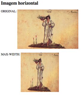
An additional problem I faced was this: I have images of different widths and heights, and I would like to limit the size of the image in the two dimensions. A wide image can occupy 55% of the width, but a very narrow image would be "stretched" to cover 55% and would be very vertical. This is particularly unpleasant on a mobile screen.

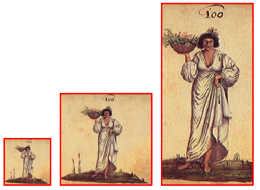
One solution is to manually change the image size (width less than 100%), another is to recalculate using Javascript (dynamically), the solution I adopted was to calculate the image aspect ratio in PHP and change the width container of the cartimg2 container to limit its height , if the image is higher than 16: 9. (Attempts to limit the height directly did not work very well.)

Here is the relevant PHP code:

function get_container_width($addr)
{
        $tallest = 16.0 / 9.0;

        $container_width = 100;

        if ($addr[0] == '/') {
                $addr = $_SERVER["DOCUMENT_ROOT"] . $addr;
        }

        list($width, $height) = getimagesize($addr);
        if ($width > 0 && $height > 0) {
                $prop = $width / $height;
                if ($prop < $tallest) {
                        // image is 'tall', or thin
                        // we need to limit width to limit height indirectly
                        $container_width *= $prop / $tallest;
                }
        }

        return $container_width;
}

    $container_width = get_container_width($addr);

    echo("<div id='$name' class=cartimg>");
    echo("<div id='hdiv_$name' style='width: $container_width%;' class=cartimg2>\n");
    echo("<a href='$addr' class=noarrow>\n");
    echo("<img src='$addr' alt='$desc'>\n");
    echo("</a>\n");
    echo("</div>");
    echo("<i>$desc</i>\n");
    echo("</div>");

The solution using background instead of img also works to limit height and width, except that you are playing the web semantics outside (Google finds the images by the img tag, and their descriptions by the alt attribute).

    
27.09.2015 / 07:49
0

simple ..

You limit the width you want at most as 100% of the div where the image is contained .. and the height you set as auto!

example:

#apresentacao-texto-loop img {width:100%;height:auto !important;}

I always put it like this and resize proportionately;)

    
17.11.2016 / 21:31
How to measure code performance in PHP? How to horizontally center one div within another?