


I know it sounds confusing, is there a way for a layout to be "ready" to be visibly responsive when the client resizes the browser and to any device?
How to leave a layout ready for all resolutions
11
asked by anonymous 23.09.2014 / 19:33
4 answers
4
If you want to do this from start to finish, I recommend combining media queries combined with relative dimensions of page elements (instead of pixels use% or .em for fonts).
Media Queries:
link (For general knowledge and openness) link (more complete specification) link (Some examples)
Another alternative would be to use a framework, which would deal with the "responsiveness" of your page:
link (Top 10 of the most used frameworks, choose and use)
I believe that with these guidelines there is already an idea of what to look for.
24.09.2014 / 17:06
13
Some considerations:
Resolution
The first, and most obvious, rendering difference between devices that you need to watch is the resolution, usually measured in pixels - the number of points on each screen. As a simple rule, the more pixels the larger the space for displaying elements.

Butanotherfactorshouldbetakenintoaccount:
Density
Thedensityofadeviceisequaltotheamountofpixelsthatcanberepresentedinagivenarea.ThemostcommonmeasureisDPI,dotsperinch,dotsperinch).Myexperienceisthatthisisthepointofgreatestconflictwhendesigningawebsolutionthatfitsbothviewsondesktopandonmobiledevices:.Manycellphonestodayhavehigherresolutionsthan1080pstandardmonitors
Theresultisvisuallysimilartoresolutiondistortion,withtheadditionalfactorthatyourinterfaceonthemobiledevicewillbegreatlyreduced.
To help the development of responsive sites, the standard CSS3 introduced the so-called Media queries , where different behaviors can be associated with different resolutions:
@media(max-width:767px){}
@media(min-width:768px){}
@media(min-width:992px){}
@media(min-width:1200px){}
To complicate your life, devices like the iPad do not report changes in the size of Viewport when rotated (changing so portrait to landscape for example.)
Viewport scaling
One of the outputs is to turn off the zoom factor on mobile devices caused by the higher density, using the following meta tag:
<meta name="viewport" content="width=device-width">
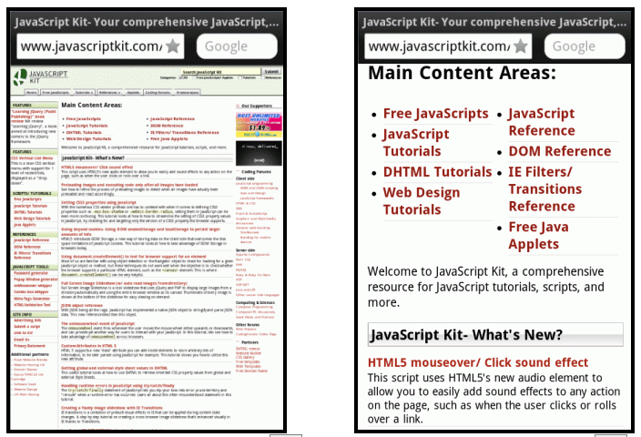
This is an example page viewed without the meta viewport (left) and with the viewport set (right):
23.09.2014 / 21:32
12
You need to use the media queries with styles css to format your code according to the resolution used. Example of average queries:
@media screen and (min-width: 320px) { html, body {background-color: red} }
@media screen and (min-width: 480px) { html, body {background-color: green} }
@media screen and (min-width: 640px) { html, body {background-color: yellow} }
@media screen and (min-width: 768px) { html, body {background-color: blue} }
@media screen and (min-width: 992px) { html, body {background-color: gray} }
If you fix, for each screen resolution the background-color color change attribute.
You can write your media queries right inside the .css style sheets or between the <style></style> tags inside a html or php of them.
Since media queries are not well received by IE8 and earlier, one of the workarounds for trying to get close to the desired result in these browsers is to include the following code in your web content:
<!--[if lt IE 9]>
    <script src="http://css3-mediaqueries-js.googlecode.com/svn/trunk/css3-mediaqueries.js"></script>
<![endif]-->
This will allow media queries to be recognized by the above browsers.
23.09.2014 / 19:39
2
There is, and it's called Responsive Design . Where all layouts are defined for various resolutions.
And what opened the doors to this design was the media querys .
I recommend studying the subject thoroughly if you want to be a web designer.
23.09.2014 / 19:39