Avoid line wrap (collapsing) in col-md bootstrap

4

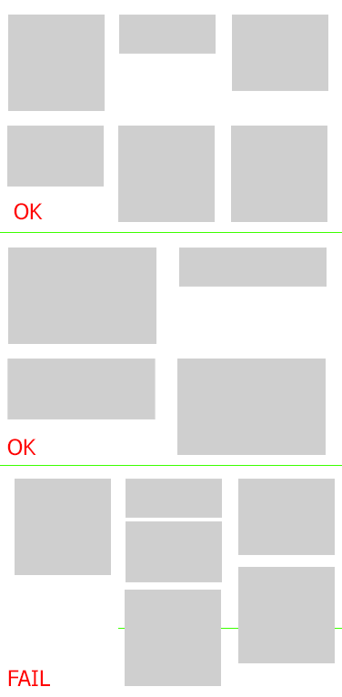
I'm doing a grid that will appear some products, up to 3 per line, in mobile 1 per line, the problem is that the height varies and hence in the monitors it 'pushes' one over the other.

Solution would be to put a height: 270px fixed, however for mobile layout I can not.

My HTML

 <div class="container ">
            <div class="row">
                <div class="col-md-4 col-sm-6 col-xs-12 grid">1 - teste de linha Gigante e sempre vai dar algum problema
                    <img src="http://letscode.ghost.io/content/images/2015/09/stackoverflow.png"width="350" alt="" class="img-responsive img-thumbnail">
                </div>
                <div class="col-md-4 col-sm-6 col-xs-12 grid">2 - teste
                    <img src="http://letscode.ghost.io/content/images/2015/09/stackoverflow.png"alt=""  width="200">
                </div>
                <div class="col-md-4 col-sm-6 col-xs-12 grid">3 - teste
                    <img src="http://letscode.ghost.io/content/images/2015/09/stackoverflow.png"alt="" width="200">
                </div>
                <div class="col-md-4 col-sm-6 col-xs-12 grid">4 - teste</div>
                <div class="col-md-4 col-sm-6 col-xs-12 grid">5 - teste teste teste teste teste teste teste teste teste teste teste teste teste teste teste teste teste teste</div>
                <div class="col-md-4 col-sm-6 col-xs-12 grid">
                    1 - teste de linha Gigante e sempre vai dar algum problema
                    <img src="http://letscode.ghost.io/content/images/2015/09/stackoverflow.png"alt="" class="img-responsive img-thumbnail">
                </div>
                <div class="col-md-4 col-sm-6 col-xs-12 grid">
                    2 - teste
                    <img src="http://letscode.ghost.io/content/images/2015/09/stackoverflow.png"alt="" width="200">
                </div>
                <div class="col-md-4 col-sm-6 col-xs-12 grid">
                    3 - teste
                    <img src="http://letscode.ghost.io/content/images/2015/09/stackoverflow.png"alt="" width="200">
                </div>
            </div>
    </div>

Example on the fiddle link In the fiddle it is difficult to visualize the big screen, to see how it twists.

I tried to do it through: But I think I must have confused something, it should work.

@media (min-width: 768px) {
    .col-sm-1, .col-sm-2, .col-sm-3, .col-sm-4, .col-sm-5, .col-sm-6, .col-sm-7, .col-sm-8, .col-sm-9, .col-sm-10, .col-sm-11, .col-sm-12 {
        max-height: 146px !important;
    }
}

@media (min-width: 992px)
{
.col-sm-1, .col-sm-2, .col-sm-3, .col-sm-4, .col-sm-5, .col-sm-6, .col-sm-7, .col-sm-8, .col-sm-9, .col-sm-10, .col-sm-11, .col-sm-12 {
    max-height: 250px !important;
}
}

But without success.

Update [18/05/2016] It has been proposed to use <div class="row" > to every 12 elements. But if I have an option that varies by device, that is to -md- screen would be every 3 items a row , but to screen -sm- every 2 items and to -xs- 1 item per row. / p>

Below is an image that illustrates my problem

    
asked by anonymous 17.05.2016 / 19:57

1 answer

1

Your amount of grids is wrong, even if you use .row , .col-*-4 should only have 3 divs in a same .row

To know if the quantity always adds the .cols the total MUST always be 12, that is:

  • If you only use .col-*-4 then it will be 3, because 4 + 4 + 4 = 12
  • If you use .col-*-6 it will be 6 + 6 = 12
  • You can also do 6 + 3 + 3 = 12 for example.

In your case there are eight divs with .col-*-4 , so 8x4 = 32, ie the result is different from 12 and this is why the problem or other problems (which you probably tried to resolve with CSS and ended up tying in the game which is now causing this problem).

I recommend to read the link documentation before using because, although easy to understand, many things in the bootstrap are not intuitive just to use, like this one in English I go through some important GRID passages here:

  • The .rows must be placed within a .container (fixed width) or .container-fluid (full width) for proper alignment and fill (if it does not, this will affect the margins) / p>

  • Use .rows to create horizontal column groups.

  • The content must be placed inside columns ( .col-*-* ) and columns should always be daughters of .row and no other element.

  • The .col-* generates spaces between them. Spacing is compensated at .row through negative margin.

  • Grid columns ( .col-* ) are created to have specifically available 12 columns that you can extend. For example, three equal columns would use three .col-xs-4 .

  • If more than 12 columns are placed within a single row, each group of additional columns will break to a new row.

  • The .col- classes apply width:; to screens with a size greater than or equal to the minimum size (defined in the half-queries) and if the device has the smaller screen, it will replace the class .col- set for smaller screens. So if you use any .col-md-* class for an element it will not only affect your style on devices of the chosen screen size (md, lg, sm, etc), but also affect larger screens if a .col-lg-* class is not present this is an example).

The most correct would be something like:

    <div class="row">
        <div class="col-md-4 col-sm-4">
            Foo bar baz
        </div>
        <div class="col-md-4 col-sm-4">
            Foo bar baz
        </div>
        <div class="col-md-4 col-sm-4">
            Foo bar baz
        </div>
    </div>

    <div class="row">
        <div class="col-md-4 col-sm-4">
            Foo bar baz
        </div>
        <div class="col-md-4 col-sm-4">
            Foo bar baz
        </div>
        <div class="col-md-4 col-sm-4">
            Foo bar baz
        </div>
    </div>

    <div class="row">
        <div class="col-md-4 col-sm-4">
            Foo bar baz
        </div>
        <div class="col-md-4 col-sm-4">
            Foo bar baz
        </div>
        <div class="col-md-4 col-sm-4">
            Foo bar baz
        </div>
    </div>
    
17.05.2016 / 23:13