As said by the comments, I think is the best option for responsiveness:
Bootstrap works with a grids system to position the elements on the page.
This mechanism works as a sort of abstract table, and is responsive, mobile-oriented, and adjusts according to the screen when it changes size or orientation.
/ p>
Columns in Bootstrap define the vertical divisions of
rows of your layout.
Columns must always be within the rows, and they define spaces in the
row for you to place the visual items or contents that were
designed.
So in Bootstrap, you have rows and columns for
define a layout. It is exactly like a grid or matrix (or
table), however, using div's with classes.
To create a column you can create a div with the prefixes
pre-defined by Bootstrap, as in the example:
<div class"container">
  <div class="row">
    <div class="col-md-6"> </div>
    <div class="col-md-6"> </div>
  </div>
</div>
In this example, we have a row (.row) with two columns (.col-md-6).
Number six, at the end of each column class, defines the space that
she occupies in the line. So, in this example, we would have the row (row)
divided exactly in the middle by two columns, since we use the number
six.
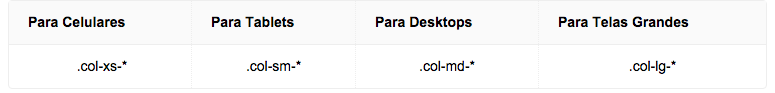
Column prefixes are used to indicate on which screen types the
column will remain positioned as in the main design. The prefixes
have the following pattern:
Isuggestthelinks: How to use the grid , Bootstrap Documentation


