Good afternoon guys,
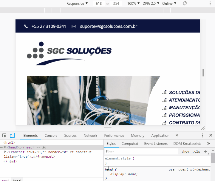
I developed a website for a client, in wordpress, the site is sgcsolucoes.com.br. My problem is that it looks like the responsive css is not catching. The desktop site is right. When I open the phone, it opens the same version of the desktop, but when I go to the customize menu and choose the responsive mode, the simulator stays right, but when I open the phone the desktop version continues to appear.
I have already disabled all plugins, I have already chosen another theme, and it still does not work.
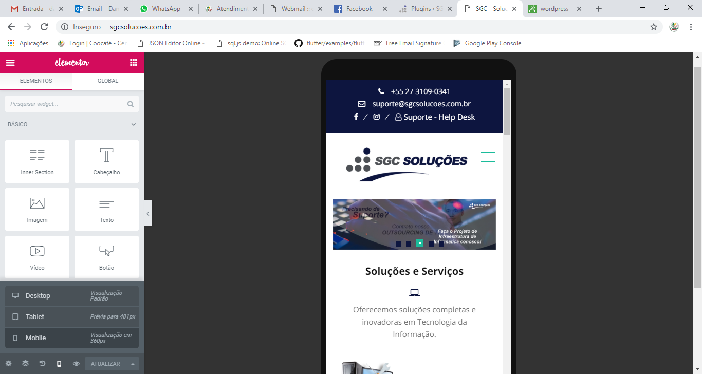
The Responsive Site should look like the image.
Thank you!