How to make the amount of IVD to adapt

-1

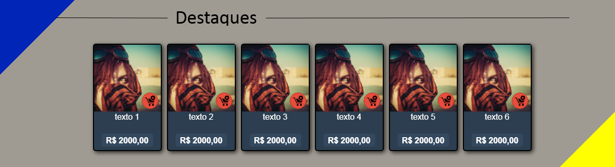
Good afternoon, my doubt is as follows, in my site there is a section where the highlights part, and in this section there are 6 more DIVs to display the products (image)

Well,sofarsogood,theproblemisthatwhenyouzoomin,theystarttogroupthemselvesdownandgetmessedupwiththebottom

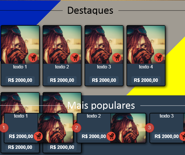
What I figured out as a solution to this problem is that while it zooms, instead of organizing itself down it just disappears, but I do not know how to do it ... And that's the best way to fix it?

    
asked by anonymous 10.10.2017 / 17:37

2 answers

-1

See if this is what you want ...

#conteiner{
  display: flex;
  flex-wrap: wrap;
  justify-content: center;
  align-content: space-between;
  height: 200px;
  width: 100%;
  overflow: hidden;
  resize: horizontal;
}
.item{
  flex-basis: auto;
  width: 198px;
  height: 198px;
  border: solid 1px black;
}
<div id="conteiner">
  <div class="item">Ítem 1</div>
  <div class="item">Ítem 2</div>
  <div class="item">Ítem 3</div>
  <div class="item">Ítem 4</div>
  <div class="item">Ítem 5</div>
  <div class="item">Ítem 6</div>
</div>
    
10.10.2017 / 17:57
0

I think using the Bootstrap grid would solve your problem.

<div class="row">
    <div class="col-md-2">
        <!-- Conteúdo-->
    </div>
    <div class="col-md-2">
        <!-- Conteúdo-->
    </div>
    <!-- ... -->
</div>

Adapt this code to your need and so should solve your problems.

    
10.10.2017 / 17:41