make part of my zoom div, is it possible?

-1

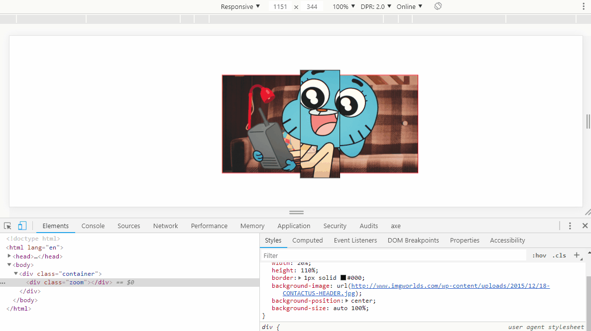
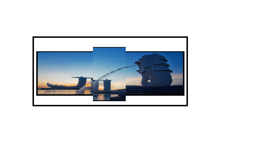
Suppose I have an overflox: hidden div

and I put a background image in another div that is inside it.

The image occupies the entire background of the div, but I want the image when it is between 40-60% of the width of the div to be stretched as if it were a zoom.

Follow the example I made of an image

ThebeginningofwhatItriedtodowithcssandhtmlwasthis

<div style="marginTop: 10px, height: 370px, overflow: hidden, backgroundColor: red, position: inherit, alignItems: center, justifyContent: center }}>
        <div id="A-negociation" style="display: 'flex', width: 'auto', left: 0, position: 'absolute', paddingLeft: 20px }}>
          
            // card do meio
           
                <div style="margin: 35px"}}>
                  <img src="http://www.imgworlds.com/wp-content/uploads/2015/12/18-CONTACTUS-HEADER.jpg"style="height: '300px'" alt="card aguardando" title="aguardando pagamentos" />
                </div>              
        </div>
      </div>
    
asked by anonymous 04.12.2018 / 20:27

1 answer

3

Yes it is possible, you can use background-size or transform:scale() to increase background or div along with your background.

With background-size the size of div always remains the same, 20% of the width of the parent, and 110% of the height of the parent, you only change the size of BG within the child. If you want you can simplify using a pseudo-element ::after with BG etc, just done so to make it easier to understand;)

OBS: I preferred not to use your example template, since it has the inline style and syntax not enabling the snippet here

Templatecodeabove:

.container {
    width: 400px;
    height: 200px;
    display: flex;
    justify-content: center;
    align-items: center;
    border: 1px solid red;
    margin: auto;
    background-image: url(http://www.imgworlds.com/wp-content/uploads/2015/12/18-CONTACTUS-HEADER.jpg);
    background-size: cover;
    margin-top: 50px;
}
.zoom {
    width: 20%;
    height: 110%;
    border: 1px solid #000;
    background-image: url(http://www.imgworlds.com/wp-content/uploads/2015/12/18-CONTACTUS-HEADER.jpg);
    background-position: center;
    background-size: auto 150%;

}
<div class="container">
    <div class="zoom"></div>
</div>

Option with transform:scale()

Notice that the middle element will actually be 22% of the width of the parent, because scale(1.2) will increase the element by 20%, as well as the height will be 120%, 10% up 10% down. But the result was cool, I think it might suit you.

.container {
width: 400px;
height: 200px;
display: flex;
justify-content: center;
align-items: center;
border: 1px solid red;
margin: auto;
background-image: url(http://www.imgworlds.com/wp-content/uploads/2015/12/18-CONTACTUS-HEADER.jpg);
background-size: cover;
margin-top: 50px;
}
.zoom {
width: 20%;
height: 100%;
border: 1px solid #000;
background-image: url(http://www.imgworlds.com/wp-content/uploads/2015/12/18-CONTACTUS-HEADER.jpg);
background-position: center;
background-size: cover;
transform: scale(1.2);
}
<div class="container">
    <div class="zoom"></div>
</div>
    
04.12.2018 / 21:09