The way your code is, just put a margim-bottom in p :
p{
  margin-bottom: 110px;
}
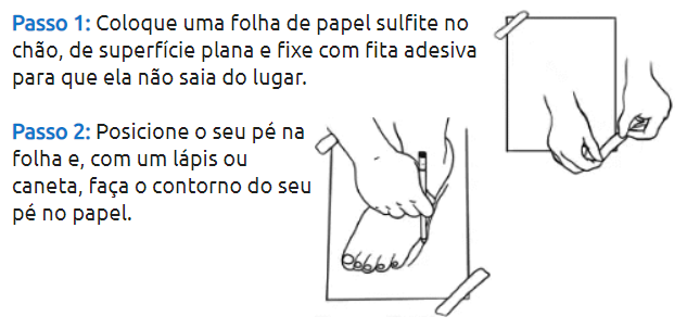
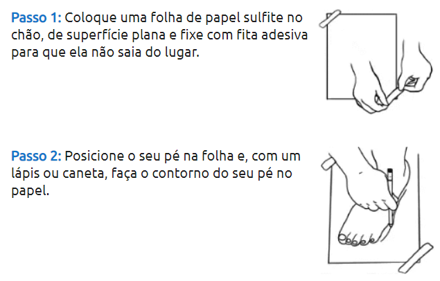
<p><img style="float:right" src="https://www.zaffiori.com.br/image/catalog/como-medir/passo-1-fixar-folha-de-sulfite.png"><b>Passo1:</b>Coloqueumafolhadepapelsulfitenochão,desuperfícieplanaefixecomfitaadesivaparaqueelanãosaiadolugar.</p><p><imgstyle="float:right" src="https://www.zaffiori.com.br/image/catalog/como-medir/passo2.png"><b>Passo2:</b>Posicioneoseupénafolhae,comumlápisoucaneta,façaocontornodoseupénopapel.</p>
Butsinceyouareusingbootstrapyoucandothis:
<link rel="stylesheet" href="https://stackpath.bootstrapcdn.com/bootstrap/4.1.3/css/bootstrap.min.css">

<div class="row">
  <div class="col-sm-10 col-md-10">
    <p><b>Passo 1:</b> Coloque uma folha de papel sulfite no chão, de superfície plana e fixe com fita adesiva para que ela não saia do lugar.</p>
  </div>
  <div class="col-sm-2 col-md-2">
    <img src="https://www.zaffiori.com.br/image/catalog/como-medir/passo-1-fixar-folha-de-sulfite.png"></div></div><divclass="row">
  <div class="col-sm-10 col-md-10">
    <p><b>Passo 2:</b> Posicione o seu pé na folha e, com um lápis ou caneta, faça o contorno do seu pé no papel.</p>
  </div>
  <div class="col-sm-2 col-md-2">
    <img src="https://www.zaffiori.com.br/image/catalog/como-medir/passo2.png">
    </div>
</div>